

Good UX UI design is not decoration. It is the difference between a visitor who finds what they need and one who leaves without a word. For Singapore business owners and marketers, the question is rarely whether a site looks modern. It is whether customers can understand the offer, find their way around, and complete a purchase or enquiry without friction.
This guide takes a practical position: UX and UI are measurable business levers, and most websites lose customers through a small number of preventable, well-documented failures. Rather than a checklist of design theory, you get a Five-Gate Usability Audit you can run yourself, covering first impressions, findability, friction, access and recovery. Each gate ends in a pass, fail or unknown, so you know what to fix first.
Key takeaways
- Good UX and UI are business levers, not decoration. Most sites lose customers through a handful of preventable usability failures.
- Visual appeal sets the first impression, but function drives abandonment. Complicated forms, weak search and broken mobile layouts cause most of the damage.
- Work through the Five-Gate Usability Audit in order: First Impression, Findability, Friction, Access and Recovery.
- Fix a failing gate before commissioning any visual redesign. The audit produces a prioritised fix list, not a redesign brief. If your brief is already written, read the current e-commerce design trends first so the brief reflects what actually converts rather than what looks current.
- Forms are the cheapest win. The average checkout carries 11.3 fields when 8 will do, and 17% of shoppers abandon because the process feels too complicated.
- Test on mobile and check accessibility on every release. Half of mobile visitors leave a page that takes more than three seconds to load.
UI and UX are two halves of one job
Most Singapore businesses treat UI and UX as the same job, or assume one of them is a finishing touch. The gap between them is where customers leave.
UI design covers what the visitor sees and touches: layout, typography, colour, buttons, icons and the controls that respond to a click or tap. UX design covers the whole path: why someone arrives, what they try to do, how many steps it takes and whether they feel confident at the end.
A polished button on a confusing checkout is good UI attached to poor UX. A simple, logical flow with plain styling is the reverse. Good work needs both.
Why first impressions matter
A visitor forms a view of a site almost instantly, and that view is shaped mostly by design. The commonly quoted version of this claim, that “94% of first impressions are design-related”, is worth handling carefully: it circulates widely but traces back to different institutions depending on who is citing it, and no primary study stating 94% can be located. Treat it as a signpost, not a measurement.
The underlying research is real and narrower. Lindgaard and colleagues, publishing in Behaviour & Information Technology in 2006, found that people form stable judgements of a web page’s visual appeal in as little as 50 milliseconds, and those snap judgements correlate with the ones they make after longer viewing. The Stanford-Makovsky Web Credibility Study reached a compatible conclusion from the other direction: when people explain why they trust or distrust a site, visual design is the most frequently cited factor, ahead of information quality.
Neither study says design is 94% of anything. Both say the same practical thing: the first second is doing commercial work, and if a new visitor cannot tell what your business does in that second, they will not stay to find out.
What good UX and UI looks like for a Singapore business
For a Singapore retailer or service provider, a good outcome is measurable. The visitor understands the offer quickly, finds the product or booking they came for, and completes the goal on a phone without friction. Those three conditions cover most of what matters, and each one can be checked in an afternoon. If you are building rather than fixing, our guide to building an e-commerce website that converts walks the same conditions end to end, and the e-commerce launch checklist is the version to keep open during a migration.
One caveat before the numbers. There is no reliable Singapore-specific dataset on usability failure rates, so the benchmarks in this article are global, mostly from Baymard Institute’s large-scale testing and from Google’s mobile research. Read them as direction, not as a local average. The failure modes they describe are not cultural, and they show up on Singapore sites as readily as anywhere else.
The core principles of user experience
Good UX starts from a simple premise: the user, not the designer or the business owner, decides whether a product works. User-centred design puts real people at the centre of every decision, from research through to testing. The pages that convert best are almost always the ones where someone watched a real visitor attempt a task and changed the design in response.
User-centred design in practice
User-centred design rests on three habits. Teams observe how people actually behave, test ideas with them early, and measure outcomes after launch. Designers who skip the first habit build for the version of the customer they imagine, which is rarely the one who shows up.
Shneiderman’s eight golden rules
Ben Shneiderman’s eight golden rules of interface design, first set out in his 1986 textbook Designing the User Interface, remain a practical checklist. The current published version covers consistency, universal usability, informative feedback, dialogue closure, error prevention, easy reversal of actions, user control, and reduced short-term memory load.
Note that the list has been revised since 1986 — “shortcuts for frequent users” gave way to “seek universal usability” — so if you inherited an older copy, you are working from a superseded version. You do not need to fix all eight at once. Start with error prevention and feedback, because those failures cost the most sales.
Simplicity and consistency
Simplicity means removing anything that does not help the visitor reach their goal. Consistency means buttons, labels and layouts behave the same way across every page. When a Singapore shopper learns that a blue button means “continue” on the product page, that meaning should hold at checkout too.
Criteria for good UI design
Good UI design is judged by a few concrete tests, and visual polish is only one of them. The three below map directly to the first two gates of the audit: can a visitor tell what the site does, and can they reach the goal without help?
Visual hierarchy
Visual hierarchy tells the eye what matters first. Size, weight, colour contrast and spacing should signal the primary action on each screen, with secondary options visibly subordinate. When every button looks equally important, visitors pause, scan and often leave. The cheapest fix is also the most common: reduce competing calls to action to one primary and one secondary per screen. Our guide to conversion rate optimisation strategies covers how to test whether the change actually moved the metric.
Feedback and responsiveness
Every tap or click should produce an immediate, visible response: a button state change, a loading indicator, a confirmation message. Silence reads as a broken site, and users retry, duplicate orders or abandon. Checkout is where this matters most, because a shopper who cannot tell whether their payment went through will assume it failed.
Error prevention and recovery
Preventing an error is better than explaining one. Inline validation that flags a wrong postcode as the user types, date pickers that block impossible dates, and clear confirmation before a destructive action all reduce mistakes. When errors still occur, the message should say what went wrong and how to fix it in plain words, without losing what was already entered. Recovery is the test that separates a usable interface from a frustrating one, and it is the fifth gate of the audit below.
Accessibility is a baseline, not an add-on
Accessibility is often treated as a feature for a small group of users, something to add once the design is finished. The evidence points the other way. When basic checks are skipped, the failures are predictable, measurable and concentrated in the same four places.
What the benchmark actually found
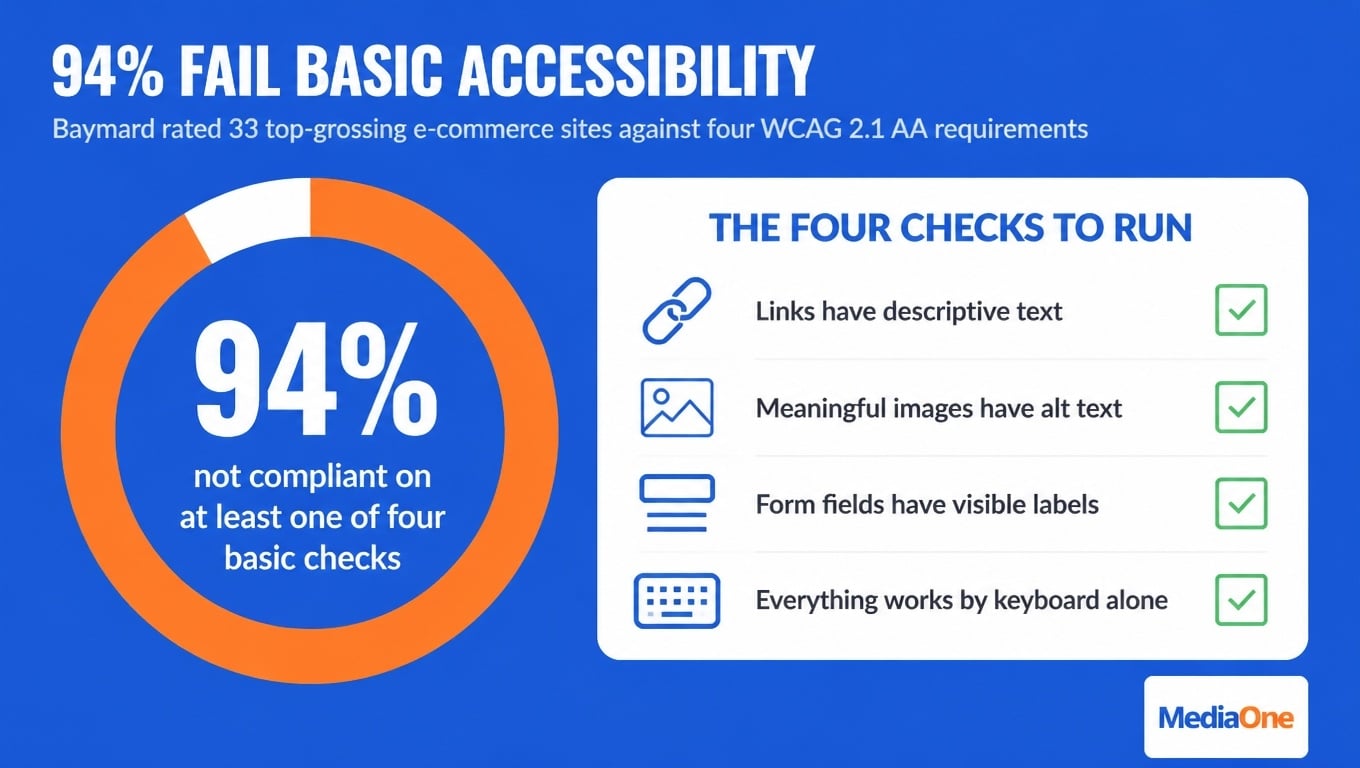
Baymard Institute rated 33 top-grossing e-commerce sites against four core accessibility requirements and found that 94% were not compliant with WCAG 2.1 AA on at least one of them. The breakdown is the useful part (Baymard accessibility benchmark):
|
Accessibility area |
Sites with compliance issues |
|
Images (alt text and labels) |
82% |
|
Links (descriptive text, contrast) |
73% |
|
Keyboard navigation (operability, focus visibility) |
64% |
|
Form fields (labels, grouping, instructions) |
58% |
These are not edge cases. They are the things a screen reader or a keyboard-only user hits within the first minute of a visit. And these are the largest, best-funded sites in the sample; the researchers note that smaller sites with less budget should be expected to fare worse, not better.
The lesson is that accessibility failures rarely come from bad intent. They come from teams that never tested with a keyboard or a screen reader. Treating accessibility as a baseline means checking it on every release, not auditing once after complaints arrive. The WCAG 2.2 specification is the reference standard to hold yourself to.
Accessibility checks to run on every release
- Links: every link has descriptive text, not “click here”.
- Images: every meaningful image has alt text; decorative images carry an empty alt attribute. Our guide to image alt text and file names covers the writing side.
- Form fields: every input has a visible, programmatically linked label, and required fields are marked in text, not by colour alone.
- Keyboard navigation: you can reach and operate every control using only Tab, Shift+Tab and Enter, with a visible focus indicator and no focus traps.
- Mobile layout: touch targets are large enough to tap accurately, and text stays readable without zooming.
If any check fails, the release is held. This is the Access gate, and it passes before any visual polish is reviewed.
Where good UX and UI is won or lost
Most interfaces do not fail dramatically. They lose customers through a small set of ordinary, preventable problems, and the same four recur across Singapore retail and service sites: a homepage that does not explain itself, search that does not match what people type, forms that ask for too much, and mobile layouts that break under real use.
Homepage and search: the findability gate
The homepage is where visitors decide whether to stay, and the product list is where they decide whether to keep going. Baymard’s e-commerce benchmark rates 58% of desktop sites as “mediocre” or worse on product list and filtering UX, which means the page most stores treat as a solved problem is the one quietly losing them.
Search is the next failure point, and it is worse than most owners assume. Across more than 170 benchmarked sites and apps, 46% of desktop sites, 58% of mobile sites and 64% of apps deliver “mediocre or worse” search UX (Baymard search benchmark). Only 44% reach “decent” or “good”.
Test this yourself in ten minutes: type the five terms your customers actually use — including the misspelled ones — and check whether the top results match what you would expect. If a search for a product you definitely stock returns nothing, the shopper concludes you do not sell it and leaves. They rarely search again.
Forms, checkout and mobile: the friction and access gates
Form length is the most reliably damaging friction on a site, and it is measurable. Baymard’s checkout research puts the average flow at 5.1 steps and 11.3 form fields — down from 11.8 in 2021 and 12.7 in 2019, but still above the eight fields most sites actually need. The finding that matters: the number of fields affects usability far more than the number of steps, and Baymard’s optimisation guidance puts the achievable reduction at 20–60% once you remove fields the site never needed (average checkout length).
That matters because 17% of shoppers have abandoned a checkout specifically because the process felt too long or complicated (Baymard cart abandonment statistics). A store processing 6,000 orders a month is losing roughly a thousand of them to form design alone.
Some of the waste is visible in the benchmark itself: 89% of sites still split the name field in two, 70% show a coupon code field, and 35% show it by default — a field that exists mainly to send shoppers off-site to hunt for codes.
Mobile is the sharpest loss, because it compounds speed and layout. 53% of mobile visits are abandoned when a page takes longer than three seconds to load, according to Google’s mobile speed research. On a phone, test your checkout end to end, with one thumb, on a mid-range device — not the flagship in your pocket on office wi-fi. Our guides to page speed testing and Core Web Vitals cover the measurement side, and mobile-responsive design covers the layout side.
The counterpoint is fair: visual polish matters, because the first second is doing commercial work. But polish cannot rescue a checkout that asks for twelve fields.
The Five-Gate Usability Audit
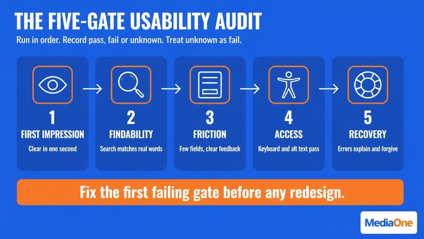
This is the part to actually run. The audit has five gates, taken in order, because each one depends on the one before it: there is no point optimising checkout conversion on a site where nobody can find the product.
Score each gate as pass, fail or unknown — and treat unknown as a fail for prioritisation purposes, because “we have not checked” and “it is broken” carry the same risk to revenue. The first gate that fails sets your next piece of work. Do not skip ahead.
The five gates
|
Gate |
The question it answers |
How to test it |
Pass means |
Fail looks like |
|
1. First Impression |
Can a first-time visitor tell what you sell and what to do next within five seconds? |
Show the homepage to three people who do not know the business for five seconds, then hide it and ask what the company does and what they would click. |
All three describe the offer correctly and name the same primary action. |
They describe a different business, or ask what the site is for. |
|
2. Findability |
Can a visitor locate a specific product, service or answer without help? |
Give five tasks using your customers’ own words. Include one exact product or service name, one category search, one misspelling. |
Every task succeeds in under a minute, and search returns the right item first. |
Any task ends in a “no results” page, or the tester concludes you do not offer it. |
|
3. Friction |
How much work stands between wanting the thing and completing the action? |
Count every field and every step in the primary flow on mobile. Time a complete order or enquiry with one thumb. |
Field count is at or below your minimum viable set; the flow completes without a single avoidable field. |
Twelve fields, a forced account, a coupon box, or a step the user cannot skip. |
|
4. Access |
Can someone using a keyboard, a screen reader or a small screen complete the same task? |
Tab through the primary flow. Run a screen reader on the checkout or form. Test at 200% zoom. |
Full keyboard operability, visible focus, labelled fields, no traps, readable at 200% zoom. |
Focus disappears, a control cannot be reached, or a field announces itself as “edit text”. |
|
5. Recovery |
When something goes wrong, does the visitor know what happened and how to continue? |
Submit a form with a deliberate error. Trigger a payment decline in test mode. Abandon mid-flow and return. |
Error text names the field and the fix, entered data survives, and the return path resumes where it stopped. |
A generic “something went wrong”, a cleared form, or a dead end with no route back. |
Reading the result
Run the audit on your single most valuable flow — the one that produces revenue, not the one that is easiest to test. Then read the outcome like this:
|
Pattern |
What it means |
What to do first |
|
Gate 1 fails |
Positioning problem, not a design problem |
Rewrite the above-the-fold message before touching the layout |
|
Gate 2 fails |
Navigation or search problem |
Fix search relevance and category naming; add synonyms and misspellings |
|
Gate 3 fails |
Form and flow problem |
Cut fields to the minimum set, drop forced accounts, hide the coupon box |
|
Gate 4 fails |
Technical debt, usually markup |
Add labels, alt text and focus styles; hold the release until it passes |
|
Gate 5 fails |
Trust problem at the worst moment |
Rewrite error copy, preserve data on failure, add a visible recovery route |
|
Gates 1–5 all pass, conversion still low |
Your checkout is not the constraint |
Look at traffic quality and offer before redesigning anything |
That last row is the one owners skip. If the site passes all five gates and still does not convert, a redesign will not help and the money is better spent on the offer or the audience. Our website audit guide covers how to widen the diagnosis beyond usability once the gates come back clean.
What the audit is not
It is not a redesign brief, and it is not a score to publish. It is also not a substitute for knowing what a fix costs: our breakdown of website design cost in Singapore gives you the range before you brief anyone. It is a prioritisation device: five checks, in order, each producing one of three answers. Most Singapore sites that run it find they fail two gates, and that both fixes are cheaper than the visual refresh they were about to commission. If you would rather have it run against your site by the team that does this weekly, our website design service covers the audit and the fixes.
The UX design process
Good UX rarely comes from a single brainstorm. It comes from a repeatable sequence where each step tests the assumptions of the one before it. The four steps below can be run by a business owner without a dedicated design team.
Step 1: Research and define the problem
Name the user task you want to fix, not the page you want to redesign. Pull your analytics and look for where visitors stop — a sharp drop-off on one step is more informative than a low sitewide average. Then ask customers what they were trying to do. A problem statement that reads “shoppers abandon checkout at the delivery step” gives you something to test. “Our site needs a refresh” does not. If you are unsure whether the drop is a usability problem or a traffic problem, start with bounce rate diagnosis.
Step 2: Design and prototype
Sketch two or three layouts for the task and build clickable prototypes before development begins. Prototypes are cheap to change. A flow that fails on paper will fail in code, only more expensively.
Step 3: Usability testing
Watch real people attempt the task on your prototype. Give them the goal, not the path, and stay silent while they work. The sessions usually expose the problem within the first two or three participants. The method is covered in the next section.
Step 4: Iterate and measure
Change one thing at a time, then measure the same task metric you set in Step 1. Checkout completion rate, form completion rate and search-to-click rate are good starting points; our guide to optimising web pages sets out how to keep those metrics stable while you change the page. If the number does not move, return to Step 1 rather than adding more features.
Usability testing in practice
Usability testing is where the audit stops being theory. Before any redesign, watch real people attempt the tasks your business depends on. You will usually find the failures in minutes.
How to run a five-user test
Five participants give you roughly an 85% chance of finding the usability problems that affect one in three users — the finding behind Nielsen’s five-user rule, and still the most efficient starting point for a small team. Nielsen himself later qualified it: the more usable your interface already is, the more users you need to find the remaining 15%. Run several small rounds rather than one large study.
The method is simple:
- Pick three to five tasks that map to a gate: “find the price of your most popular service” (Findability) or “pay for an order on your phone” (Friction).
- Recruit participants who match your real customers, not colleagues who already know the business.
- Ask them to think aloud, and say nothing when they struggle. Silence reveals more than hints do.
- Record where they hesitate, misread a label, tap the wrong element or give up.
- Note the pattern across all five sessions. A problem seen by three or more people is a priority fix.
A usability testing checklist
- Each task has a clear goal and a written success condition before the session starts.
- Participants match your actual customer profile, including mobile use.
- The session is recorded, with consent, so you can review hesitations later.
- Failures are logged against the gate they belong to.
- The top fixes are ranked by how many participants were affected and how much revenue the task protects.
Build a Good UX UI for Your Business
Good UX and UI are not decoration. They are measurable levers, and most Singapore websites lose customers through a handful of preventable failures. The evidence points the same way: 17% of shoppers abandon checkouts that feel too complicated, 53% of mobile visits are abandoned past three seconds, and 94% of the largest e-commerce sites fail basic accessibility requirements.
Work through the Five-Gate Usability Audit in order: First Impression, Findability, Friction, Access and Recovery. Record pass, fail or unknown for each. Fix the first failing gate before you commission a redesign, and let that fix list set your priorities. If every gate passes and revenue is still flat, the problem is upstream of the site, and a visual refresh will only make the same traffic look better while converting the same.
Frequently asked questions
What is the difference between UI and UX?
UX is the overall effectiveness of using a product: can people find what they need, complete the task, and recover when something goes wrong. UI is the visible layer they interact with — buttons, colour, typography, layout. UX decides whether the flow works; UI makes that flow visible and usable. A pretty interface with a broken checkout still fails.
Why do good UX and UI matter for Singapore businesses?
Singapore shoppers are heavily mobile-first, expect fast checkout, and compare options within seconds. Usability failures cost sales directly: 17% of shoppers abandon checkouts that feel too long or complicated. Fixing those gaps is usually cheaper than buying more traffic to compensate, because the same visitors convert at a higher rate. Our CRO service exists for exactly that trade-off.
How do I know if my interface is accessible?
Start with four checks: every link and button has a descriptive label; every image has appropriate alt text; every form field has a visible, linked label; and the whole site can be operated by keyboard alone with a visible focus indicator. Tab through your key pages without a mouse — it takes ten minutes. Automated checkers catch many failures but miss context, so pair them with a manual pass. Given that 94% of the largest e-commerce sites fail these same four checks, expect to find problems.
How many users do I need for usability testing?
Five per round, for a single task or flow. Each additional participant surfaces fewer new issues, so several small rounds beat one large study. Recruit people who resemble your real customers, and give them realistic tasks rather than asking for opinions.
How often should I run usability tests?
A round before any major redesign, and again after launching significant changes. For an active e-commerce or service site, a light quarterly round focused on the highest-value flows, such as search, checkout, booking, works well. Test sooner if analytics show a sudden conversion drop or a rise in abandonment on one page.
What should I fix first if I cannot afford a redesign?
Whichever gate fails first. In practice, that means the above-the-fold message, then search relevance, then form fields. Cutting form fields from 11.3 to the eight Baymard says most sites need is a content and markup change, not a design project, and it addresses the single largest stated reason for checkout abandonment.