| AI Summary
Information website design helps visitors find answers, understand how topics relate and decide what to do next. Singapore businesses can improve an information site by grouping related pages around customer questions, linking them through topic hubs and checking how they work on a phone. A five-point audit covers page openings, category structure, internal links, page layout and next steps. |
What is information website design? Information website design is the way a site organises and presents content so visitors can find answers. It combines topic categories, menus, page headings and links between related pages. A reliable structure helps visitors understand where they are, even when they land on an article directly from search.
Key Takeaways
- Customer questions can reveal gaps in the menu. An enquiries log may show that customers look for “Fees” while the site files prices under “Resources”.
- A topic hub needs a job of its own. A short overview and links labelled by question help readers choose the right guide.
- A phone test should start on an article. That starting point shows whether a new visitor can understand the page and find related information without first seeing the homepage.
- An audit score of zero gives the team a specific fix. A missing link on a high-priority page can deserve attention even when the site scores well overall.
A parent comparing weekend coding classes may open a page from Google and look for the age range, class schedule and location. If those details live on three pages with vague labels, the parent has to piece together the answer. The business may then receive a message asking for details it already publishes.
Information website design starts with moments like that. The sections below use a fictional Singapore training provider to show how a small team can organise content, test it on a phone and turn the results into a practical website brief.
What Makes an Information Website Work?
An information website gives readers reliable answers about a subject. A reference site may help visitors look up terms or rules. A learning site may take them through a skill. A business resource centre may help customers compare services, prepare for an appointment or understand how a process works. One website can support several of these jobs, as long as each section has a purpose readers can recognise.
A visitor usually arrives with a task in mind. Someone choosing a class may need the age range first. A parent who has already booked may want to know what their child should bring. Both visitors care about the same programme. Their questions call for different pages or sections. A well-planned information architecture groups content according to how visitors expect to find it.
How different information sites organise their pages
| Website type | Typical visitor question | Structure that helps |
| Reference site | “Where can I look up this term?” | A topic index, consistent entries and links to related terms |
| Learning site | “What should I learn next?” | Lessons grouped by subject or level, with a way to continue |
| Business resource centre | “What do I need before I book?” | Topic pages for fees, locations, requirements and preparation |
| Support centre | “How do I sort out this problem?” | Task-based categories, steps readers can follow and a way to get help |
The TED-Ed lesson library offers a learning example. Readers can browse lessons by subject, then open a lesson for a specific question or idea. A training business could apply the same pattern to its own material. A page for first-time learners can introduce the programme and direct readers to separate answers about fees, schedules and preparation.
The website’s purpose also helps the team decide what to leave out of the main menu. A news archive may deserve its own section if regular visitors look for past announcements. If customers mainly arrive to compare classes or find directions, those tasks deserve the more visible links. A brief website project scope can record the audience, its main tasks and who can approve changes before the team starts on layouts.
How to Structure an Information Website for Findability
A site structure shows which pages belong together and how visitors move between them. A simple structure may run from the homepage to a topic hub and then to a guide. A topic hub is a page that introduces a subject and points readers to more specific answers. Many visitors will enter through one of those answers, so the links should also work from the guide back to the hub.
Start with questions customers already ask
Enquiry emails, call notes and search queries give the team a starting list. The most valuable entries often sound ordinary. “What time is the Saturday class?” tells the team more about a visitor’s task than a broad phrase like “programme information”. A list of ten recurring questions is enough to begin mapping an existing site.
| Customer question | Best place for the answer | What the page needs |
| “Which class suits my child?” | Programme overview | Age groups, levels and any entry requirements |
| “How much does it cost?” | Fees page | Price, what it covers and any separate charges |
| “Where is the class?” | Locations page | Address, nearest MRT station and arrival details |
| “What should my child bring?” | First-class guide | A short checklist and where to get help |
Each question should have a main home. A programme page can mention that fees vary by class and take readers to the fees page for the full details. If several pages list the same prices, a change can leave customers looking at different figures. The same approach applies to office hours, timetables and other details that change.
The homepage should establish what the business offers and show visitors where to begin. A short description and links to the main topics often give a first-time visitor what they need to make a choice. A homepage that leads with a promotion can still put essential links such as “Class schedules” and “Locations” within easy reach.
The main menu should help visitors move from any page. Labels such as “Fees”, “Locations” and “Class schedules” tell readers what they will get after a tap. A label such as “Explore” can cover many things, which makes it harder to predict the result. A short menu with well-named sections usually gives people enough direction to make their first choice.
The site map can be as simple as a spreadsheet with the page name, its main topic and its parent page. An existing content management system may already support the categories and page templates needed to put that map into practice. The important part is checking how the structure works on the live site, where visitors can enter on any page.
How to Build Content Clusters Around Customer Questions
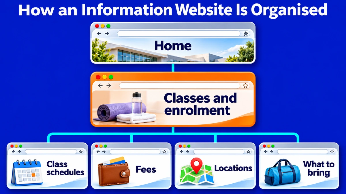
A content cluster is a group of pages that answer related questions. The hub introduces the subject. Each supporting page answers a question that needs its own space. In the training example, “Classes and enrolment” is the hub. Class schedules, fees, locations and what to bring are supporting pages. Each page does a different job, so readers can compare options without sorting through the same information several times.
Decide when a question needs its own page
A question can stay on a hub if the complete answer takes a sentence or two. If the answer needs its own table, examples or instructions, a supporting page gives it room. A provider with one location can put the address and nearest MRT station on the hub. A provider with several venues may need a locations page with access details for each one.
A hub should help readers decide where to go. A short line under each link can explain what the page covers. For example, a class schedule link can say that the page lists days and times by age group. A fees link can mention whether the page covers registration and materials. These descriptions give the reader enough information to choose a page.
Add links at the point where a new question comes up
A class schedule can link to the locations page beside the venue name. The fees page can link to schedules when it explains that fees vary by class. Each supporting page can also link back to the hub so readers arriving from search can find the full set of options. This pattern gives the internal linking strategy a purpose readers can see.
Google recommends crawlable links with descriptive anchor text. On a schedule page, “class fees” gives both readers and Google more context about the destination than “click here”. A link also needs to go to the page that contains the promised answer. An address link that lands on a general contact page may send the reader searching again.
If two old guides answer the same question, the team can compare them and decide which page should hold the full answer. A technical SEO audit can help identify broken internal links and redirect issues before pages are merged or moved. The team can then update links in menus, guides and any reusable blocks that pointed to the old page.
How to Design Pages People Can Use on a Phone
A reader on a phone should be able to recognise the page, find the answer and see a way forward. The page title and opening lines do much of that work. A page called “Weekend class fees” can state what the fees cover near the top and follow with a price table if the figures vary by class. Details such as payment arrangements or materials can sit beneath their own headings.
Make headings, tables and links easy to read
Short sections let readers scan for the piece they need. W3C’s guidance on page headings also shows why the heading order should reflect the content. A page title can introduce the subject, an H2 can mark each main section and H3s can group details within that section. Screen reader users can use those headings to move through the page.
| Page element | What to check on a phone |
| Opening text | The title and first lines show what question the page answers. |
| Price or timetable table | The reader can match the labels to the right values on a narrow screen. |
| Menu and links | Link names make sense, and nearby controls leave room for a thumb. |
| Text and buttons | The words remain readable against the background, including on photos and banners. |
| Pop-ups and fixed bars | An offer, chat button or banner leaves the answer and controls accessible. |
The WCAG AA minimum contrast criterion calls for a ratio of at least 4.5:1 for normal text and 3:1 for large text. The WCAG 2.2 AA target size criterion sets a minimum of 24 by 24 CSS pixels for pointer targets, with exceptions including adequate spacing.
The reflow criterion addresses whether people can read and use content in a narrow view without scrolling in two directions, with exceptions for content that needs a two-dimensional layout. A real phone test helps the team see where these issues affect the page.
Test from a page a search visitor might open
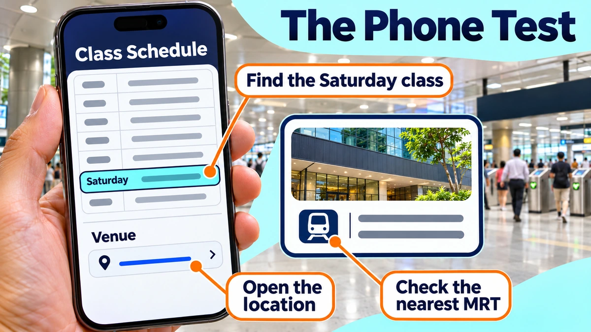
A phone test can begin with the class schedule page, using a search result or a direct link. The tester can look up the Saturday session, open its location and find the nearest MRT station. The team should note where the tester pauses, taps the wrong item or returns to the start. Those moments often show exactly which label, link or table needs work.
Google’s mobile-first indexing documentation explains that it uses the mobile version of a site’s content for indexing. The team should check that mobile visitors can get the same main information available on desktop, including fees, dates and requirements. If a banner or lead image delays access to the answer, the team can review it as part of website speed optimisation.
Where to Place Calls to Action
A call to action tells a reader what they can do next. The next step may be informational, such as checking a schedule, or it may lead to an enquiry. Its job depends on the page. Someone who has just checked a date may need directions. Someone who has compared fees, dates and locations may be ready to ask about a place.
A strong action label describes the result. “See class schedules” tells readers what opens next. “Ask about class availability” works when the destination gives readers a way to ask about an available place. A label such as “Get started” leaves more work for the reader because it could lead to a booking, an account form or another guide.
| Page | Next question | Suggested action label |
| Programme overview | “When can my child attend?” | See class schedules |
| Class schedule | “How do I get there?” | Find the venue |
| Fees page | “Is there a place in this class?” | Ask about class availability |
One primary action per page gives the reader an obvious starting point. A link within the answer can still point to related details. For comparison, Singapore’s Digital Service Standards organise the government service experience around tasks such as finding information, using a service and completing it. A business can apply the same task-based thinking when deciding what should happen after each answer.
The Five-Point Findability Audit
The findability audit shows where people have trouble locating or using information. The team can start with a topic hub, a detailed answer page and a page close to an enquiry. A test task might be “Find a Saturday class and check where it takes place.” One observer can record each pause or wrong turn while the tester works through the task in their own way.
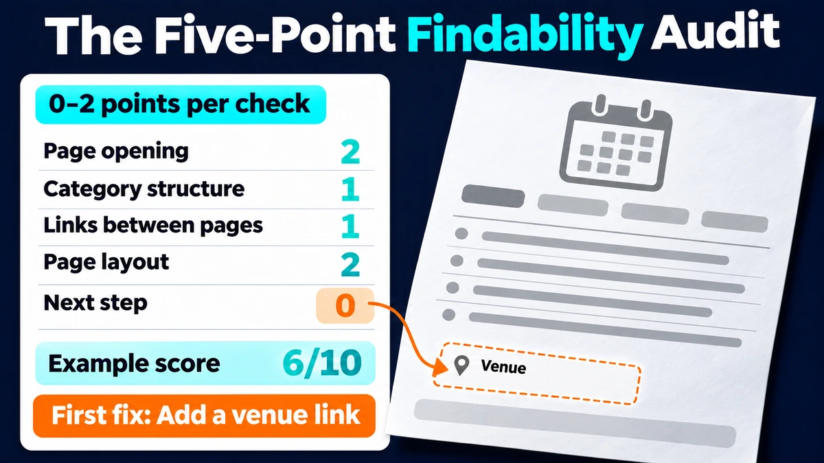
Each check earns 0, 1 or 2 points, for a maximum of 10. This scorecard is a planning tool for the site team. The total helps the team compare test rounds, and the individual scores show what to repair.
| Check | 0 points | 1 point | 2 points |
| 1. Page opening | The title or opening hides what the page answers. | The topic is visible, but the reader has to search for the answer. | The title and opening show what the page answers and where to find it. |
| 2. Category structure | The tester picks the wrong section or cannot find a relevant one. | The right section is available, but the tester takes a detour. | The tester chooses the expected section and finds the correct page. |
| 3. Links between pages | The next relevant page has no working link from the answer. | A link exists, but its wording or position makes it hard to spot. | A descriptive link appears where the next question comes up. |
| 4. Page layout | A heading, table or overlay prevents the tester from using the answer on a phone. | The tester finds the answer with extra scrolling or effort. | The tester can scan the headings and read the answer without difficulty. |
| 5. Next step | The tester reaches the end and cannot continue the task. | An action exists, but the tester is unsure where it leads. | The tester can choose a next step that matches the task. |
Turn each low score into a specific change
A low score becomes easier to fix when the team records what happened. “Improve the menu” gives the designer little direction. “The parent opened ‘Resources’ and still could not find fees” gives the team a label and a page to review. A change request could say, “Add a ‘Fees’ link to the class hub and the programme overview.”
The fictional training site might score 6 out of 10. Its openings and page layout each score 2. Its categories and internal links each score 1, and its next step scores 0. That score points to a missing action first. The schedule page could add a link to the venue beside each class, so a parent can check the location as soon as they find a suitable time.
Retest the task after the change
A second test should use the same starting page and question, ideally with someone who has not already seen the answer. The team can then compare where each tester went and whether either person needed help. A higher score is useful when the notes show that the new label or link helped the visitor complete the task.
The audit record can stay simple. Each row needs the page, the task, the observed problem, the proposed change and the person responsible. A small team can use that record to fix the most common problems first and give a designer examples from the live site. A website design buyer checklist can help the team discuss who will handle content, site structure and checks after launch.
Build an Information Website Around Customer Questions
An information website works when visitors can find the answer they came for and continue to the next part of their task. Topic hubs give related pages a home, and descriptive links help people move between them. A phone test and the five-point audit show where those choices help readers and where a page still needs work.
At MediaOne, we plan website structure and design pages around the tasks customers come to complete. If your resource centre is growing or visitors keep asking for details you already publish, our website design and development team can help turn the gaps you find into a site structure and page layouts your team can manage.
Frequently Asked Questions
Should an information website have a search box?
A search box helps when a site has many pages, people look for specific names or older resources are hard to browse. A small site with a short menu may be easy to use without one. If the site offers search, the team can try real queries, common nicknames and spelling variations. A results page should show enough detail for readers to tell similar pages apart.
Should downloadable PDFs have their own webpage?
A webpage is useful when visitors need a quick answer, such as a deadline, price or list of documents to bring. The page can show those details and offer the PDF for printing or offline use. The download link can name the file and identify it as a PDF, so people know what will open before they tap.
How should a business handle information in multiple languages?
Each language version should cover the information its readers need, especially prices, dates and booking steps. A visitor changing languages should land on the equivalent page when it exists. One named owner can check that changes reach each version. If a translation is pending, a brief label beside the language option can help set expectations.
When should an older information page be reviewed?
A change to a price, service, timetable or eligibility rule should prompt a review of the pages that mention it. The team can also set a routine review date for content people rely on before booking or visiting. On pages where timing affects the answer, a last-reviewed date can help readers understand how current the information is.
What should happen to a page for a service that has ended?
A page may still help people who need a record, contact details or a route to a replacement service. In that case, the opening can state that the service has ended and explain what visitors can do now. If another page answers the same need, a redirect can take people there. Menu links and references on related pages should reflect the change.