Mobile SEO is no longer an optional part of website optimisation. People use smartphones to research products, compare services, find local businesses and make purchasing decisions. If your website is difficult to navigate, slow to load or missing important information on a phone, you risk losing both potential customers and search visibility.
Google uses the mobile version of a website’s content for indexing and ranking. This means your mobile experience needs to provide the same essential information as your desktop site, even if the layout is different.
For businesses in Singapore, mobile SEO is particularly important for searches with local intent. Someone looking for a nearby restaurant, tuition centre, clinic or professional service may want to call, check directions or make an enquiry directly from their phone.
This guide explains how mobile-first indexing works, how to improve responsive design and page speed, which mobile usability problems to address first, and how to audit your website using a practical Mobile Readiness Scorecard.
Key Takeaways
- Google primarily indexes the mobile version of your website. Important content, links and structured data should be available on mobile.
- Responsive design is usually the most practical approach. It allows one website to adapt to different screen sizes without maintaining separate desktop and mobile URLs.
- Core Web Vitals help measure user experience. Focus on loading speed, responsiveness and visual stability.
- Avoid disruptive overlays. Promotional pop-ups and interstitials should not prevent visitors from accessing your content.
- Audit website templates, not just individual pages. A problem with your product, service or article template can affect many URLs.
- Make important actions easy to find. Phone numbers, contact details, opening hours and enquiry buttons should be straightforward to access on mobile.
1. Why Mobile SEO Matters for Singapore Businesses
Smartphones have become an important way for people to access information and online services. Singapore’s digital environment makes this especially relevant for businesses that depend on online discovery and customer enquiries.
The Infocomm Media Development Authority (IMDA) publishes information about smartphone ownership, internet usage and digital activity in Singapore. Its Digital Society statistics provide useful local context for businesses planning their digital experiences.
However, mobile SEO is not simply about having a website that fits on a smaller screen. It involves making sure that visitors can access the information they need without unnecessary effort.
Consider someone searching for a dental clinic in Singapore. They may want to find the clinic’s location, check its opening hours, read about available treatments and call to arrange an appointment. If the mobile page hides these details, loads slowly or makes the contact button difficult to tap, the visitor may leave and choose another provider.
A good mobile experience should make it easy to:
- Understand what the business offers.
- Find relevant product or service information.
- Navigate between important pages.
- Read content without zooming or horizontal scrolling.
- Contact the business or complete a transaction.
- Access important information without disruptive interruptions.
Mobile usability also supports broader SEO objectives. A website that is easier to use can help visitors engage with its content and complete important actions.
For a wider overview of search optimisation, see MediaOne’s SEO services in Singapore.
2. Mobile-First Indexing and What Google Evaluates
Mobile-first indexing means Google primarily uses the mobile version of a website’s content when crawling, indexing and ranking pages.
This does not mean Google maintains a completely separate mobile ranking system. It means the mobile version is the main version Google uses to understand your website.
According to Google’s mobile-first indexing documentation, websites should provide equivalent primary content across their desktop and mobile versions.
Content parity between desktop and mobile
Content parity means that the important information available on your desktop website is also available on its mobile version.
This includes:
- Main headings and body content.
- Product and service descriptions.
- Images and relevant image information.
- Internal links and navigation.
- Customer reviews and product specifications.
- Relevant structured data.
- Important page elements that help users understand the subject.
Your mobile layout does not need to look identical to your desktop layout. It can use a different navigation structure, smaller image arrangements or collapsible sections.
The important point is that mobile users and search engines should still be able to access the same substantive information.
Can Google index content inside accordions and tabs?
Yes. Content placed inside an accordion or tab is not automatically excluded from Google’s index simply because it is initially collapsed.
However, the content should be included in the page’s HTML and should not depend on a visitor clicking, swiping or typing before it becomes available to Google.
For example, a product page may use collapsible sections for specifications, delivery information and frequently asked questions. This can be a practical way to organise a long mobile page, provided the underlying content is accessible.
Avoid loading essential content only after a user interaction if Google needs to discover it.
How to check content parity
Use the following process to compare your desktop and mobile pages:
- Identify your main website templates, such as the homepage, service page, product page, category page, article and contact page.
- Select representative URLs from each template.
- Compare the main headings, body content, links, images and structured data.
- Check whether important information is missing or only available on desktop.
- Review the rendered mobile page using Google Search Console’s URL Inspection tool.
- Correct any differences that prevent users or search engines from accessing important content.
You do not need to compare every URL manually at the beginning. Start with representative pages and investigate any template-level problems.
Metadata and structured data on mobile pages
Mobile pages should retain the important technical SEO elements found on desktop pages.
Check the following:
Title tags and meta descriptions
Make sure the page’s title and description accurately represent its content. A responsive website generally uses the same URL and metadata across devices.
Canonical tags
Confirm that canonical tags point to the preferred URL. This is particularly important if your website uses separate desktop and mobile URLs.
Structured data
Check that relevant structured data is present and accurately describes the page. For example, a product page may contain product information, while a local business page may include relevant business details.
Use Google’s Rich Results Test to check supported structured data features.
Internal links
Make sure important links remain accessible on mobile. A navigation menu that works on desktop but hides key pages or makes them difficult to reach on a phone can create usability and discovery problems.
How Googlebot accesses mobile pages
Google uses a smartphone crawler for mobile-first indexing. If your mobile page blocks important resources, hides essential content or requires user interactions to load primary information, Google may not be able to understand the page as intended.
Review your website for:
- Important resources blocked by robots.txt.
- Mobile-specific redirects that send visitors to irrelevant pages.
- Content that appears only after a click or swipe.
- Images that Google cannot crawl.
- Different robots meta tags between desktop and mobile versions.
- Mobile pages that return errors or fail to render properly.
The objective is to make the mobile version accessible, complete and technically sound.
3. Responsive Web Design and Mobile Usability
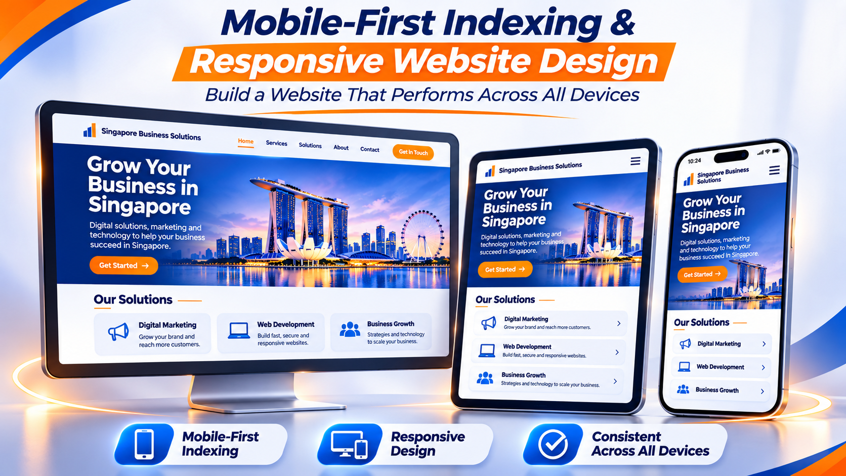
Responsive web design allows a website to adapt to different screen sizes while using the same URL. Instead of maintaining separate desktop and mobile websites, one set of pages adjusts its layout according to the visitor’s device.
For most businesses, responsive design is the most straightforward approach to maintaining mobile content parity and reducing technical complexity.
Google also recommends responsive design as a practical configuration for mobile websites.
How responsive design works
A responsive website uses several technical elements to adapt its layout.
Viewport meta tag
The viewport setting tells the browser how to display a page according to the device’s screen width.
CSS media queries
Media queries allow developers to apply different styles at different screen sizes. For example, a three-column desktop layout can become a single-column layout on a phone.
Flexible images and containers
Images and content containers should resize according to the available screen space rather than forcing the page to remain wider than the device.
Flexible typography
Text sizes, line heights and spacing should remain readable across different screen sizes.
The result is a website that can display the same essential information in a layout suited to each device.
Common responsive design mistakes that affect mobile SEO
| Problem | Likely cause | Recommended fix |
|---|---|---|
| Important sections are missing on mobile | Different mobile template or content hidden from the page | Restore equivalent primary content |
| Text is difficult to read | Small fixed font sizes or poor spacing | Use readable typography and appropriate line heights |
| Buttons are difficult to tap | Tap targets are too small or too close together | Increase target size and spacing |
| Visitors need to scroll sideways | Fixed-width images, tables or containers | Use flexible widths and responsive layouts |
| Content shifts while loading | Images or embeds do not reserve space | Specify image dimensions or aspect ratios |
| Navigation is difficult to use | Crowded menus or unclear mobile navigation | Simplify the mobile navigation structure |
Practical mobile usability recommendations
A responsive website should be easy to use, not merely technically responsive.
Consider these improvements:
- Use readable font sizes and sufficient contrast.
- Give buttons and links enough space to avoid accidental taps.
- Keep navigation menus simple.
- Make forms easy to complete on a touchscreen.
- Prevent images and embedded content from extending beyond the viewport.
- Use clear headings to divide long pages.
- Make important calls to action easy to identify.
- Avoid requiring visitors to zoom in to read ordinary text.
A 48-pixel square tap target can be a useful design reference, although the appropriate size depends on the interface and surrounding spacing.
Testing your website across screen sizes
Do not rely on a single desktop browser preview to assess mobile usability.
Test representative pages at different viewport widths, including:
- 320 pixels for narrower mobile layouts.
- 390 pixels for a common modern smartphone viewport.
- 768 pixels for tablet-sized layouts.
Also check landscape orientation and test on an actual smartphone where possible.
Google’s mobile-first indexing guidance provides technical recommendations for mobile website configurations.
4. Core Web Vitals and Mobile Page Speed

A mobile page should load its main content quickly, respond smoothly to user interactions and remain visually stable while loading.
Google uses Core Web Vitals to measure three important aspects of page experience:
- Loading performance.
- Interactivity.
- Visual stability.
The three current Core Web Vitals are Largest Contentful Paint (LCP), Interaction to Next Paint (INP) and Cumulative Layout Shift (CLS).
Understanding the three Core Web Vitals
| Metric | What it measures | Good target |
|---|---|---|
| Largest Contentful Paint (LCP) | How quickly the main content appears | 2.5 seconds or less |
| Interaction to Next Paint (INP) | How quickly a page responds to user interactions | 200 milliseconds or less |
| Cumulative Layout Shift (CLS) | How much unexpected movement occurs during loading | 0.1 or less |
These targets are assessed at the 75th percentile of page visits. In practical terms, a website should aim to meet the good threshold for at least 75% of visits for each metric.
Google explains these measurements in its Core Web Vitals documentation.
Largest Contentful Paint: Improve the loading experience
LCP measures when the largest visible content element in the initial viewport is rendered.
On a mobile website, this may be a large banner image, heading or main content block.
Common causes of poor LCP include:
- Large, uncompressed hero images.
- Slow server response times.
- Render-blocking CSS and JavaScript.
- Unnecessary redirects.
- Slow-loading fonts.
- Third-party scripts that delay rendering.
To improve LCP:
- Compress large images without sacrificing too much visual quality.
- Use modern image formats such as WebP or AVIF where supported.
- Improve server response times.
- Reduce unnecessary JavaScript and CSS.
- Avoid lazy-loading the main above-the-fold image.
- Preload important resources when technically appropriate.
Interaction to Next Paint: Make pages respond faster
INP measures how responsive a page feels when a visitor interacts with it.
For example, a user may tap a navigation button, open a menu, select a product option or submit a form. If the page takes too long to respond, the experience feels sluggish.
Common causes of poor INP include:
- Excessive JavaScript execution.
- Large third-party scripts.
- Complex event handlers.
- Unnecessary background tasks.
- Heavy page builders or plugins.
To improve responsiveness, reduce unnecessary scripts, break up long-running JavaScript tasks and review third-party tools that run on every page.
Cumulative Layout Shift: Prevent unexpected movement
CLS measures unexpected layout movement while a page loads.
For example, a visitor may start reading a paragraph when an image or advertisement loads above it, pushing the content down.
Common causes include:
- Images without defined dimensions.
- Advertisements that load without reserved space.
- Late-loading banners.
- Dynamically inserted content.
- Web fonts that cause substantial layout changes.
To improve CLS:
- Specify image width and height attributes.
- Reserve space for advertisements and embedded content.
- Use stable dimensions for banners and promotional elements.
- Review how web fonts load.
- Avoid inserting content above existing content without reserving space.
Image optimisation for mobile websites
Images often account for a substantial portion of a webpage’s download size. Optimising them can improve loading performance, particularly for visitors using mobile data connections.
Use these practices:
- Choose efficient formats. Consider WebP or AVIF where appropriate.
- Resize images properly. Do not serve an unnecessarily large image when a smaller version is sufficient.
- Use responsive images. The
srcsetandsizesattributes allow browsers to select an appropriate image size. - Specify image dimensions. Reserve space to reduce unexpected layout movement.
- Lazy-load below-the-fold images. This can reduce initial loading work, but avoid lazy-loading the main image that determines LCP.
- Review image quality. Compression should reduce file size without making images visibly poor.
Mobile page speed checklist
Use this checklist to identify common performance problems:
-
Run representative mobile URLs through Google PageSpeed Insights.
-
Review field data when available, rather than relying only on a laboratory score.
-
Identify the page’s LCP element.
-
Compress and resize large images.
-
Use responsive image delivery.
-
Remove unnecessary JavaScript and CSS.
-
Review third-party scripts, chat widgets and social embeds.
-
Reserve space for images, advertisements and other dynamic elements.
-
Check the Core Web Vitals report in Google Search Console.
-
Re-test after implementing changes.
Page speed is an important part of a good website experience, but a high PageSpeed score does not guarantee high search rankings. Focus on improvements that make the website genuinely faster and easier to use.
For additional technical optimisation advice, read MediaOne’s mobile SEO best practices guide.
5. Pop-Ups, Interstitials and Other Disruptive Elements
Pop-ups and overlays can help businesses promote offers, collect enquiries and encourage newsletter subscriptions. However, they become a problem when they prevent visitors from accessing the content they came to read.
Google refers to obstructive overlays as intrusive interstitials and dialogs. These can frustrate visitors and make it harder for search engines to understand page content.
Google explains the issue in its guidance on avoiding intrusive interstitials and dialogs.
Examples of disruptive mobile elements
Full-screen promotional pop-ups
A promotional message that covers the entire page immediately after a visitor arrives can interrupt the browsing experience.
Difficult-to-close overlays
A pop-up with a tiny close button or unclear dismissal option makes it unnecessarily difficult to reach the main content.
Multiple overlapping banners
Several promotional messages, cookie notices and chat widgets can occupy most of a phone’s screen.
App installation prompts
An app installation prompt that blocks the content can make it difficult for visitors to continue browsing.
Better alternatives to intrusive overlays
| Disruptive approach | Better alternative |
|---|---|
| Full-screen email signup on arrival | A small, dismissible banner |
| Promotional modal covering an article | An inline promotion within the content |
| Multiple overlapping banners | A consolidated notification area |
| Difficult-to-close subscription prompt | A clearly labelled close button |
| App prompt blocking the page | A non-intrusive installation suggestion |
Not every dialog is inappropriate. Some websites need to display notices for legal, security or functional reasons. The important distinction is whether visitors can still access the content and whether the element is implemented appropriately.
Mobile overlay audit checklist
Review each major website template and ask:
| Audit question | What to check |
|---|---|
| Does the overlay appear before visitors can access the main content? | Check whether it interrupts access to the page’s primary information. |
| Does it cover most or all of the screen? | Assess how much of the mobile screen the overlay occupies. |
| Can visitors dismiss it easily? | Make sure visitors can close it without unnecessary steps. |
| Is the close button clearly visible? | Check that the close button is easy to see and tap. |
| Does the overlay appear repeatedly during the same visit? | Review how frequently the overlay is displayed to the same visitor. |
| Does it interfere with navigation or form completion? | Check whether it blocks menus, buttons or form fields. |
| Is there a less disruptive way to display the message? | Consider using a small banner or an inline notification instead. |
Read, review their size, timing, placement and usability.
6. The Mobile Readiness Scorecard
A mobile SEO audit can identify many problems, but not every issue deserves the same priority.
The Mobile Readiness Scorecard is a practical internal framework for evaluating important website templates. It helps teams identify weaknesses, decide what to fix first and monitor improvements over time.
It is a suggested audit tool, not an official Google scoring system or ranking factor.
The five pillars of mobile readiness
1. Content parity
Check whether the mobile version includes the same essential content, headings, internal links and structured data as the desktop version.
2. Page speed
Review LCP, INP and CLS using real-user data where available. Identify the templates with the most significant performance problems.
3. Intrusive elements
Check whether promotional overlays, pop-ups and banners interfere with the main content or important actions.
4. Mobile usability
Review text readability, navigation, tap targets, forms, images and page layout.
5. Local information and conversion actions
For businesses serving local customers, check whether important contact details, location information, opening hours and enquiry options are easy to find.
How to score your website
Score each pillar from 0 to 2:
| Score | Meaning | Description |
|---|---|---|
| 0 | Fail | A significant issue needs to be corrected |
| 1 | Partial | The page works, but there are improvements to make |
| 2 | Pass | The page meets the audit requirement |
With five pillars, each template can receive a maximum score of 10.
Use the following suggested interpretation:
| Total score | Readiness | Recommended action |
|---|---|---|
| 0–3 | Needs attention | Prioritise critical mobile usability and content problems |
| 4–6 | Partially ready | Address the most important technical and design weaknesses |
| 7–8 | Generally ready | Improve remaining issues and monitor performance |
| 9–10 | Strong | Maintain the experience and review it regularly |
These score bands are internal prioritisation guidelines. They do not represent Google’s assessment of your website.
Worked example
The following example illustrates how a business might audit its service page template.
| Pillar | Score | Evidence | Recommended fix |
|---|---|---|---|
| Content parity | 0 | Important service information is missing on mobile | Restore the missing content |
| Page speed | 1 | Main image loads slowly | Compress and resize the image |
| Intrusive elements | 2 | No disruptive overlay appears on arrival | Maintain current setup |
| Mobile usability | 1 | Some buttons are difficult to tap | Improve button size and spacing |
| Local information and actions | 0 | Contact number is difficult to find | Make contact details easier to access |
| Total | 4/10 | Partially ready | Prioritise content and contact improvements |
After implementing the changes, repeat the assessment and record the new results.
Audit website templates rather than every URL
A template-based audit is more efficient because one design or technical problem can affect many pages.
For example:
- A product template may contain oversized images that affect hundreds of product URLs.
- A service template may hide important descriptions on mobile.
- An article template may use text that is too small to read.
- A contact template may have a form that is difficult to complete on a phone.
Start with the templates that receive the most organic traffic or generate the most valuable enquiries. Fixing a shared template problem can improve the experience across many pages at once.
7. Writing and Formatting Content for Mobile Users
Mobile SEO involves more than technical improvements. The way information is written and organised also affects how easily visitors can understand a page.
A long article may contain useful information, but readers should not have to work through large blocks of text to find the answer they need.
Write clear, direct paragraphs
Put the main point near the beginning of each section.
Use short paragraphs that focus on one idea. Break up long explanations with descriptive subheadings, lists and examples.
For instance, instead of writing:
“Businesses that wish to improve the performance of their websites on mobile devices should consider implementing a number of different technical and content-related improvements.”
Use:
“To improve mobile website performance, start with page speed, readable content and easy navigation.”
The second version communicates the point more directly.
Use descriptive headings
Headings help visitors understand what each section covers before reading it.
Avoid vague headings such as “Other Considerations” or “More Information”.
Use specific alternatives such as:
- How to Improve Mobile Page Speed
- Common Responsive Design Problems
- How to Check Content Parity
- Ways to Make Mobile Forms Easier to Complete
Organise headings logically so visitors can move through the article without losing context.
Choose the right content format
Different types of information work better in different formats.
| Content type | Recommended format | Why it works |
|---|---|---|
| Step-by-step instructions | Numbered list | Makes the sequence easy to follow |
| Several recommendations | Bulleted list | Helps readers scan individual points |
| Short comparisons | Compact table | Makes differences easier to understand |
| Detailed explanations | Short paragraphs with subheadings | Breaks complex information into manageable sections |
| Frequently asked questions | Question-and-answer format | Makes specific information easier to locate |
Avoid wide tables that force visitors to scroll horizontally. If a comparison has too many columns, consider converting it into a series of short sections or cards.
Make calls to action easy to use
A mobile page should make the next step clear.
Depending on the page’s purpose, this may include:
- Calling the business.
- Submitting an enquiry.
- Requesting a quotation.
- Booking an appointment.
- Viewing a product.
- Reading a related article.
Use clear button labels such as “Call Us”, “Request a Quote” or “View Services”. Avoid vague labels that do not explain what happens when someone taps them.
8. Local SEO and Mobile Search Intent
Many mobile searches involve immediate needs. People may be looking for nearby businesses, checking opening hours or comparing service providers in a particular area.
For Singapore businesses, this makes local information an important part of mobile website optimisation.
Make essential business information easy to find
If your business serves local customers, make sure visitors can quickly locate:
- Business name.
- Physical address or service area.
- Contact number.
- Opening hours.
- Directions or location information.
- Relevant products and services.
- Appointment or enquiry options.
Place important information where it is easy to access. Do not rely exclusively on a footer or an image to communicate your contact details.
Keep business information consistent
Your website and Google Business Profile should contain accurate, consistent business information.
Check that your business name, address, phone number and opening hours are up to date. If your business has multiple locations, make sure each location has the correct information.
You can manage your listing through Google Business Profile.
Answer questions visitors are likely to ask
Mobile visitors often want quick answers to practical questions.
For example:
- Where is the business located?
- What are its opening hours?
- Does it provide the service I need?
- How can I make an appointment?
- How much does the service cost?
Use descriptive headings and concise answers to address these questions. Include more detailed explanations where they help visitors make an informed decision.
Do not add repetitive location keywords simply to target more searches. Local content should be useful, accurate and relevant to the business.
For a broader look at local search optimisation, explore MediaOne’s SEO services.
9. How to Build a Sustainable Mobile SEO Strategy
Mobile SEO should be part of your ongoing website maintenance process, not a one-time project.
A practical strategy involves identifying important pages, correcting technical problems, improving the user experience and measuring the results.
Step 1: Identify your highest-value templates
Start with the pages that matter most to your business.
These may include:
- Homepage.
- Main service pages.
- Product and category pages.
- High-traffic blog articles.
- Contact and enquiry pages.
- Location pages.
Prioritise pages that attract organic traffic or contribute directly to leads and sales.
Step 2: Establish a performance baseline
Use Google Search Console and PageSpeed Insights to understand your website’s current performance.
Review:
- Organic search clicks and impressions.
- Indexing status.
- Core Web Vitals.
- Mobile page loading performance.
- Important URLs and page templates.
- Conversions from mobile visitors, using your analytics platform.
Record the results before making significant changes so that you can compare performance later.
Step 3: Fix critical issues first
Prioritise problems that prevent visitors or search engines from accessing important information.
A sensible order is:
- Missing or inaccessible primary content.
- Broken navigation and important internal links.
- Pages that fail to load or render properly.
- Severe Core Web Vitals problems.
- Disruptive overlays.
- Readability and touch-target issues.
- Minor visual refinements.
The exact order may change depending on the severity of the problem and the business value of the affected pages.
Step 4: Coordinate developers, designers and content teams
Mobile SEO often requires work across several teams.
Developers may need to improve rendering, scripts and responsive layouts. Designers may need to refine navigation, spacing and forms. Content teams may need to restore missing information or reorganise long pages.
Give each issue a clear description, affected template, priority and expected outcome.
Step 5: Measure the results
After implementing changes, review the same performance indicators used in your initial audit.
Look for improvements in:
- Core Web Vitals.
- Mobile organic traffic.
- Search impressions and clicks.
- Engagement with important pages.
- Enquiry form completion.
- Phone calls and other conversion actions.
Remember that search rankings can change for many reasons. Do not assume that every movement in rankings is caused by a mobile design update.
Step 6: Schedule regular reviews
Review your mobile experience after major website updates, redesigns, new plugins, theme changes or significant content releases.
A quarterly review can also help identify issues that develop gradually, such as new scripts, larger images or changes to navigation.
Build a Mobile SEO Strategy That Delivers Better Results
A strong mobile SEO strategy goes beyond making your website look good on a smartphone. It requires fast-loading pages, accessible content, responsive design and a seamless user experience that helps visitors find information and take action.
With Google primarily using your website’s mobile content for indexing and ranking, every important page should be optimised for mobile users. From maintaining content parity to improving Core Web Vitals, each improvement contributes to a more accessible and user-friendly website.
For Singapore businesses, a well-optimised mobile experience can also make it easier for potential customers to discover your services, find your contact details and submit enquiries.
Start by auditing your website with the Mobile Readiness Scorecard in this guide. Then use Google Search Console and PageSpeed Insights to monitor performance, identify technical issues and track opportunities for improvement.
Ready to improve your website’s mobile performance and search visibility? Let MediaOne help you build a stronger mobile SEO strategy. Explore our SEO services in Singapore and discover how we can help your business attract more organic traffic, improve user experience and generate meaningful results.
Frequently Asked Questions
Is mobile SEO different from regular SEO?
Mobile SEO is not a completely separate discipline. It focuses on making sure that your website provides a complete, accessible and usable experience on smartphones and other mobile devices. It includes responsive design, mobile page speed, content parity, navigation, readability and touch-friendly elements. These improvements support your broader SEO strategy.
Does Google rank mobile pages or desktop pages?
Google primarily uses the mobile version of a website’s content for indexing and ranking through mobile-first indexing. This means important content, links and structured data should be available on mobile. A responsive website is generally the simplest way to maintain consistency across devices.
How fast should a mobile website load?
For Core Web Vitals, aim for:
- LCP of 2.5 seconds or less.
- INP of 200 milliseconds or less.
- CLS of 0.1 or less.
These are Google’s recommended good thresholds, assessed at the 75th percentile of visits.
Use PageSpeed Insights and Search Console to evaluate performance. Remember that these metrics are part of a wider assessment of website experience, not a guarantee of search rankings.
Do pop-ups hurt mobile SEO?
Intrusive pop-ups can create a poor user experience and may make it harder for search engines to understand page content. Avoid promotional overlays that cover the main content, appear at inappropriate times or are difficult to dismiss. Use smaller banners and inline messages where possible.
Do I need a separate mobile website?
Most businesses do not need a separate mobile website. Responsive design allows one website to adapt to different screen sizes while retaining the same URL and primary content. This is generally easier to maintain than separate desktop and mobile versions.