In the fast-paced world of digital marketing, a compelling call to action (CTA) can mean the difference between a casual visitor and a loyal customer. Whether it’s encouraging users to sign up, make a purchase, or explore your services, mastering the art of the CTA is crucial for driving conversions and achieving your business goals.
This complete guide delves into effective call-to-action techniques that go beyond the basics, providing marketers with actionable insights to craft CTAs that truly resonate with their audience. From understanding user psychology to leveraging design elements and persuasive language, we’ll cover everything you need to know to create CTAs that not only capture attention but also inspire action.
If you’re ready to transform your marketing strategy and turn clicks into results, keep reading to discover the secrets behind high-performing CTAs.
Key Takeaways
- A compelling Call to Action must be clear, authentic, and designed to guide users toward taking specific actions, enhancing conversion rates.
- Utilising action verbs and compelling value propositions in CTAs can influence user engagement and motivate immediate responses, ultimately driving desired actions.
- Strategic placement and A/B testing of CTAs across various platforms, including emails and landing pages, are essential for optimising performance and improving user interaction.
What Makes a Call to Action Compelling?
Source: Drip
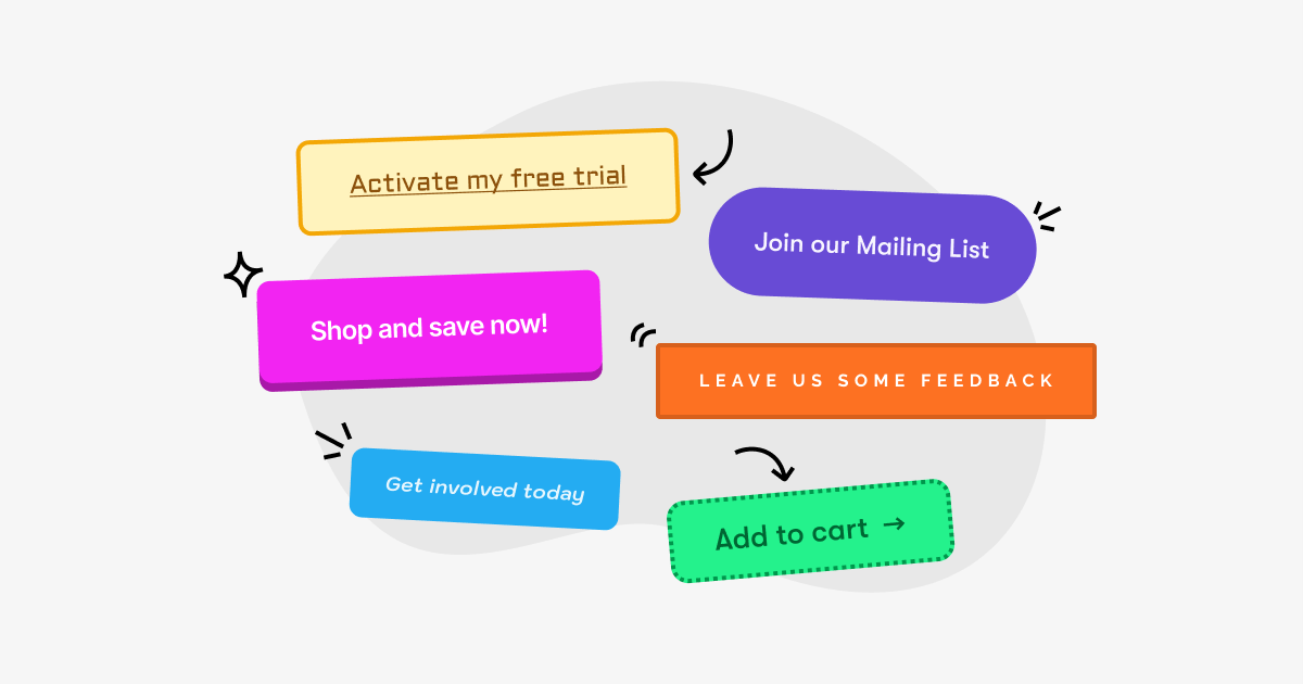
In digital marketing, a Call to Action denotes what marketers expect their audience to do next. These desired actions could vary from clicking on a link to completing a registration form to making an actual purchase. CTAs serve as navigational signs that steer users towards taking specific actions and are essential for conversions, in the absence of which guiding visitors effectively becomes challenging.
It’s crucial that your call-to-action messaging be unmistakable so users understand precisely what they should do next. A well-crafted CTA such as “Download Now” clearly conveys the expected action without ambiguity, unlike less precise instructions like “Learn More.” Ensuring authenticity within these messages maintains trustworthiness and protects brand integrity. Maintaining honesty and clarity with your CTAs is fundamental.
Integrating elements like customer testimonials can prove invaluable in instilling user assurance and reinforcing confidence in CTAs. Mastering when to leverage hard-hitting CTAs such as “Buy Now” versus more gentle nudges like “Find Out More” significantly engages audiences and enhances conversion rates.
Crafting unique calls to action tailored specifically for your target demographic is a key strategy for propelling them toward the actions you desire most.
Compelling CTA Examples from Leading Brands
Top brands expertly use calls to action (CTAs) to guide customers through their buying journey, demonstrating the potential of well-crafted prompts to significantly improve engagement and conversions. Consider the case of a B2B company that boosted its conversion rates simply by changing its CTA from “Book a Demo” to “Get Started.”
This shift to a more action-oriented and less intimidating phrase highlights the power of precise, straightforward language.
Key Characteristics of Effective CTAs
- Clarity: Direct and easy-to-understand language.
- Actionable Language: Prompts immediate action (e.g., “Shop Now”).
- Visual Appeal: Designed to stand out while complementing the brand’s visuals.
- Relevance: Tailored to the user’s stage in the customer journey.
Examples of CTAs from Leading Brands
| Brand | CTA | Purpose | Effectiveness |
|---|---|---|---|
| Nike | “Shop Now” | Encourages immediate purchase decisions | Direct and action-oriented, paired with product visuals. |
| Dropbox | “Try Dropbox Business” | Promotes free trial usage | Clear and low commitment, ideal for new users. |
| Spotify | “Get Premium” | Pushes subscription upgrades | Simple yet compelling, emphasizing exclusivity. |
| Amazon | “Add to Cart” | Simplifies the buying process | Familiar and trust-inducing for users. |
| Slack | “See How Slack Works” | Drives exploration and education | Invites curiosity and encourages interaction. |
These examples illustrate how even small tweaks to CTAs—like the choice of words or the placement—can create a major impact, converting passive users into active customers. When designing your CTAs, keep them clear, engaging, and aligned with your target audience’s preferences for maximum effectiveness.
Action Verbs That Drive Conversions
Source: YAMM
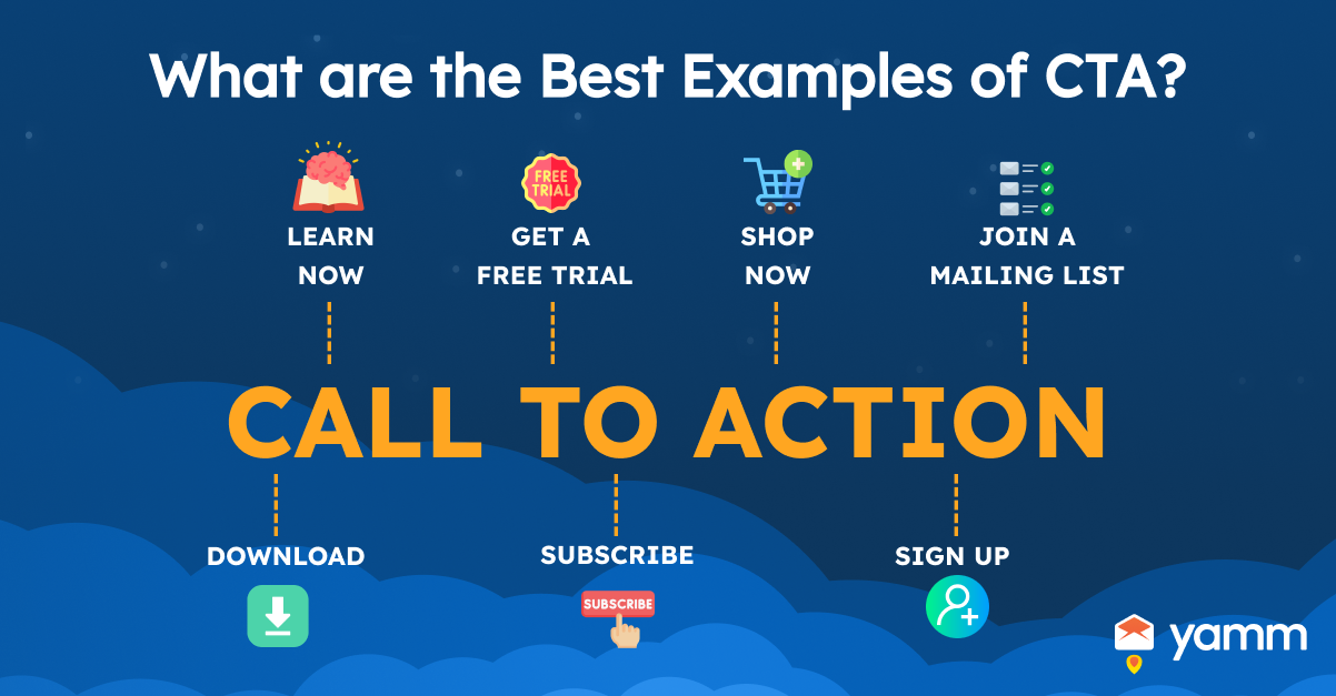
Incorporating action verbs into your calls-to-action can significantly improve user clarity and drive higher conversion rates. These powerful words provide direct guidance, compelling users to take immediate action while fostering a sense of purpose and urgency.
Key Benefits of Action Verbs in CTAs
- Clarity: Directly communicates the desired task.
- Urgency: Encourages prompt user action.
- Engagement: Boosts user interaction and emotional connection.
Examples of Action Verbs for Effective CTAs
| Category | Examples | Purpose |
|---|---|---|
| Subscription/Signup | “Subscribe,” “Join,” “Register” | Encourages users to commit to a service or community. |
| Exploration/Discovery | “Try,” “Explore,” “Discover” | Invites users to engage with content or offerings. |
| Purchasing/Conversion | “Buy,” “Order,” “Get” | Motivates users to complete transactions. |
| Engagement | “Learn,” “Watch,” “Start” | Promotes deeper interaction with content. |
| Account Actions | “Create,” “Log In,” “Claim” | Drives user account setup or access. |
Enhancing Effectiveness with Sensory Language
Pairing action verbs with sensory or emotionally resonant language can amplify their impact. For instance:
- “Get Started Today” evokes immediacy and ease.
- “Discover Your Perfect Fit” appeals to curiosity and personalization.
- “Join Our Growing Community” instills a sense of belonging.
By leveraging action-oriented, sensory-rich language, brands can create CTAs that not only drive conversions but also build stronger emotional connections with their audience.
Crafting a Clear Value Proposition in Your CTA
A strong value proposition in your call-to-action demonstrates how your product or service resolves a customer’s specific problem, distinguishing your offering from competitors. This clarity can significantly enhance the effectiveness of your CTAs.
Components of a Compelling Value Proposition
| Element | Description | Examples |
|---|---|---|
| Headline | Captures attention with a clear benefit. | “Get 30 Days of Free Yoga” – Yoga International |
| Subheadline | Provides additional details that elaborate on the primary benefit. | “Unlimited access to online yoga classes.” |
| Incentive or Offer | Highlights specific perks, such as discounts or trials, to drive engagement. | “Start Your 30-Day Free Trial Today” – Netflix |
| Features & Benefits | Explains how the offering solves a problem or improves a situation. | “Stream on any device, anytime, anywhere.” |
| Visuals | Uses images or videos to reinforce the message and engage the audience emotionally. | Image of a serene yoga pose or binge-watching scene. |
Pop-ups and banners with clear incentives, such as discounts or free trials, can also encourage immediate action. These should align with the value proposition and enhance its appeal.
Using Multiple CTAs for Different Segments
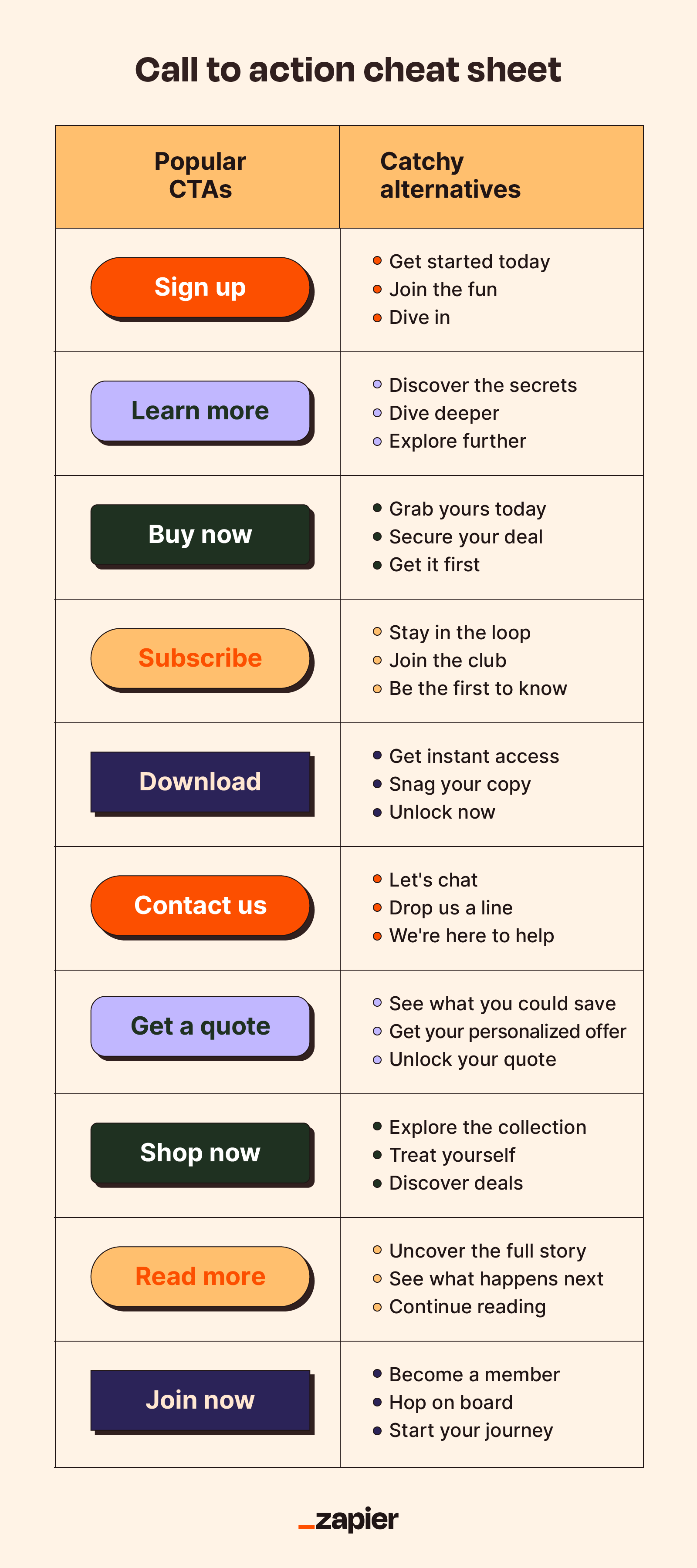
Source: Zapier
Incorporating multiple CTAs within your content caters to diverse user needs and intentions, maximizing engagement opportunities.
Strategies for Implementing Multiple CTAs:
| Approach | Description | Example |
|---|---|---|
| Extended Content Placement | Include CTAs in long emails or pages to capture both high-commitment and exploratory users. | “Start Free Trial” for decisive users; “Learn More” for cautious ones. |
| Audience Segmentation | Tailor CTAs based on user demographics or behavior. | Younger users: “Follow Us on TikTok”; Professionals: “Download the Whitepaper.” |
| Dual CTAs | Offer options for immediate action and additional exploration. | “Shop Now” and “See Reviews.” |
Benefits of Using Multiple CTAs:
- Personalization: Aligns CTAs with audience interests, increasing relevance.
- Flexibility: Adapts to different points in the customer journey.
- Improved Engagement: Ensures that every type of user has a clear path forward.
This dual-focused approach enhances the user experience by providing tailored options, ensuring a seamless flow from interest to action.
Best Practices for CTA Buttons
To ensure your CTA buttons effectively capture attention and drive conversions, consider these best practices:
- Distinctive Design: The design of your CTA button should stand out on the page. Use bold and contrasting colors that make the button immediately noticeable, especially against the background of the page. Bright, vibrant colors (like orange, green, or blue) tend to draw more attention than softer, muted tones.
- Contrast in Shape and Size: Ensure that the button has a clear shape and size that makes it easy for users to identify. Avoid overly complex designs that could detract from its purpose. The button should be large enough to click easily but not overwhelming.
- Typography: Use clear, readable text on your CTA button. The font should be legible and concise, and the text should compel the user to take action, such as “Get Started,” “Shop Now,” or “Learn More.” Keep it action-oriented and straightforward.
- Negative Space: Surround the CTA button with ample negative space to avoid visual clutter. This will help the button stand out and make it easier for users to focus on. A clutter-free design improves the chances of users clicking the button.
- Above the Fold Placement: Ensure that the CTA button is placed “above the fold,” meaning it is visible without requiring users to scroll. This improves its visibility and the likelihood that visitors will engage with it early on in their experience.
- Consistency: Keep CTA buttons consistent across your website or landing pages in terms of design and language. This creates a cohesive experience and reinforces your brand identity.
By following these best practices, your CTA buttons will not only stand out but also drive more user interaction and conversions.
Leveraging Urgency Tactics in CTAs
Urgency-driven CTAs are powerful tools for prompting immediate user action. By instilling a sense of urgency, you can significantly boost conversion rates. Here’s how to use urgency effectively in your CTA strategy:
- Use Time-Sensitive Language: Phrases like “Limited Time Offer,” “Act Now,” or “Hurry, Only X Left!” create a sense of urgency that pushes users to make quick decisions. For example, HelloFresh’s “Claim Offer” CTA motivates users to act fast, which can lead to increased conversion rates.
- Add Bonuses or Exclusive Access: Offering bonuses like “Free Gift with Purchase” or “Exclusive Access for a Limited Time” adds value and encourages faster decision-making. Limited-time promotions also make users feel they need to act now to avoid missing out.
- Visual Aids like Countdown Timers: Adding countdown timers on CTAs can visually emphasize urgency, making users aware that the opportunity is fleeting. Seeing the timer tick down encourages immediate action and reinforces the limited availability of the offer.
- Social Proof: Displaying how many people have already taken advantage of the offer, e.g., “Join 1,000+ Happy Customers,” taps into social proof. This gives users the assurance that others are engaging with your offer, making them more likely to act quickly.
- Urgency + Exclusivity: Combining urgency with exclusivity (“Only X Spots Left – Act Now!”) creates a stronger push to act quickly and secure the deal before it’s too late.
By strategically employing urgency tactics in your CTAs, you can drive users to take action quickly, boosting your conversion rates and making offers more appealing.
A/B Testing Your CTAs for Maximum Impact
Source: FasterCapital
A/B testing your CTAs allows you to fine-tune your approach and optimize performance. Here’s how you can effectively implement A/B testing:
- Create Multiple Variations: Test different CTA designs, copy, and urgency tactics to see which resonates best with your audience. You can experiment with text, button color, placement, and additional elements like social proof or countdown timers.
- Track Metrics: Use tools like Google Analytics and Hotjar to track how each variation performs. Key metrics such as conversion rates, click-through rates (CTR), and engagement time can provide valuable insights into what works best.
- Monitor Performance: Keep an eye on which CTA version drives more engagement. Test elements like urgency phrases, button placement, or the inclusion of a time-sensitive discount.
- Iterate and Optimize: Once you find a high-performing CTA, use it as your baseline. Continue testing new versions to refine your approach, ensuring you’re always maximizing your conversion potential.
Regular A/B testing allows you to continuously improve your CTAs, ensuring they’re always optimized for the best possible user engagement and conversion rates.
Incorporating CTAs in Email Campaigns
Effective CTAs are critical navigational tools for prospects, substantially boosting the performance of email marketing efforts. Nike exemplifies this by embedding a “Shop” button within their emails alongside images centred on products to stimulate purchases effectively. The strategic placement of CTAs above the fold bolsters their prominence and the probability of engaging recipients.
In email campaigns, employing bright hues and prominent fonts in CTAs captures attention and prompts readers to take action. Customisation plays an integral role. Personalised CTA invitations that prompt users to choose among gift categories foster higher interaction through a bespoke user experience.
Incorporating interactive components like buttons that navigate to personal preferences can be exceptionally potent in heightening engagement levels and facilitating conversions in email communication.
CTA Placement on Landing Pages and Product Pages
To maximise their impact, effective CTAs need to be immediately visible without the need for scrolling and prominently displayed above the fold. Chipotle’s “Order Now” button serves as a prime example of this practice in action, providing users with clear instructions on what action to take next and thereby boosting conversion rates. Calls to action that utilise decisive language propel readers forward, clarifying subsequent actions.
It’s beneficial to position call-to-action buttons at each transitional point or ‘fold’ throughout the landing page to maintain visibility and enhance effectiveness. Using interactive elements such as animations or visual pointers within your CTAs can Engage users. Employing heat maps reveals user interaction hotspots on the landing page, which helps optimise CTA placement for maximum engagement.
While it is typically not advisable to include secondary calls-to-action on landing pages due to potential diversion from the main objective of conversion, when used thoughtfully, they can serve supplementary purposes effectively—for instance, growing social media followership or promoting attendance at upcoming events—without detracting significantly from achieving primary goals.
Encouraging Further Action with Secondary CTAs
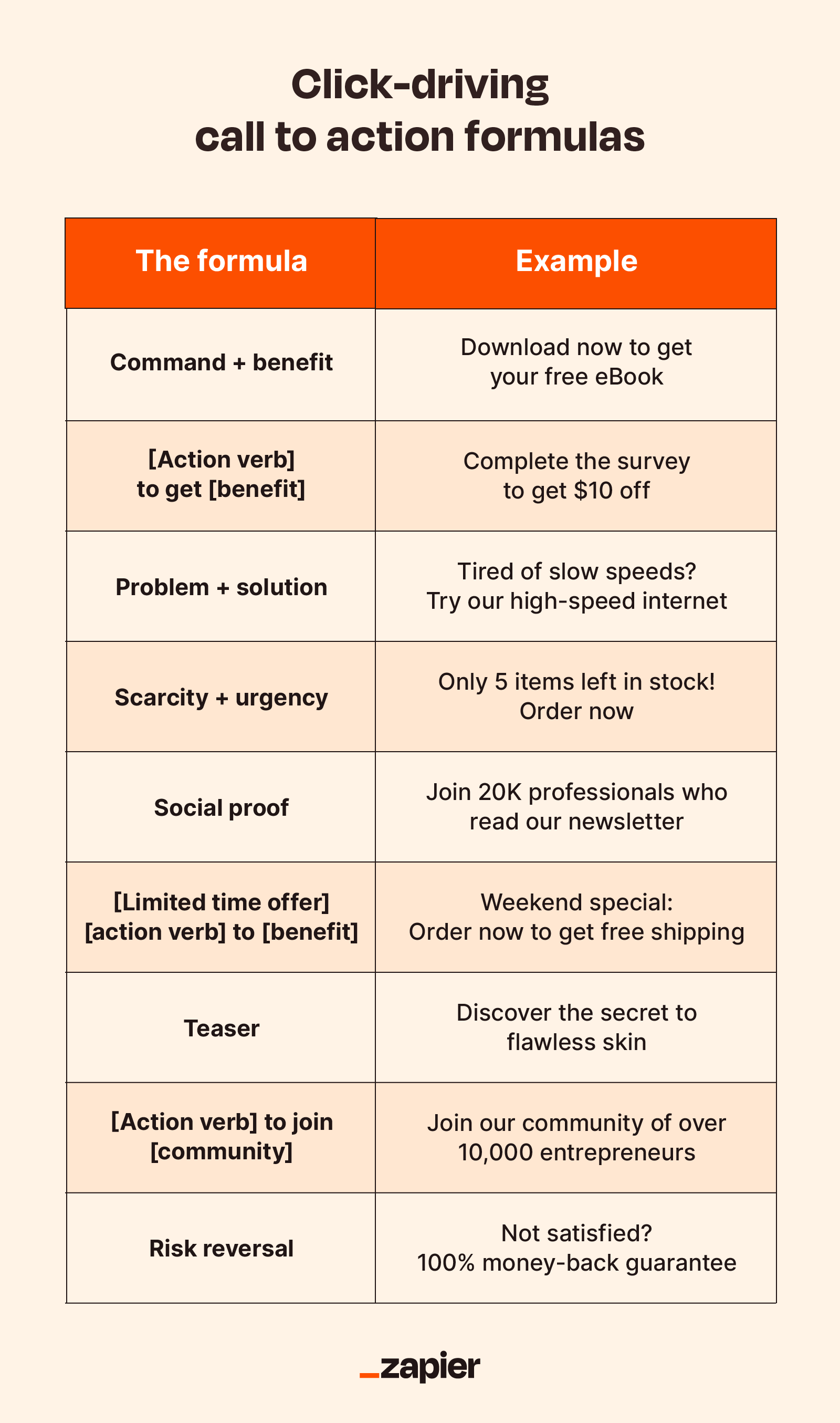
Source: Zapier
Secondary CTAs boost user engagement by offering an alternative action for visitors who are hesitant about the primary call-to-action. They also serve to maintain interest and hold onto prospective leads who might not initially engage with the primary CTA. For instance, visitors may be prompted to download a free resource via a secondary CTA if they aren’t prepared to commit to a purchase.
Incorporating secondary CTAs can advance leads through the sales funnel by catering actions suited to their level of intent or readiness. Adding these options effectively increases interaction across your website, keeping potential customers involved even when they’re not yet ready for the primary commitment.
Creating Pop-Ups with Compelling CTAs
Creating pop-ups that cater to the audience’s preferences can enhance effectiveness and engagement. Ensuring that pop-up designs are optimised for mobile is crucial for successfully engaging visitors on smaller screen devices while providing an easy way to close these pop-ups, enhancing user experience and minimising irritation.
Utilising unique visuals rather than generic stock photos can boost authenticity and engage users deeply in your pop-up campaigns. Incorporating gamification elements, like spin-the-wheel games, into your pop-ups can elevate user participation levels. Establishing clear goals for every campaign involving a pop-up allows for precisely evaluating its success and overall impact.
Examples of CTAs for Lead Generation
The “Get Estimate” CTA from Billshark motivates users by offering a benefit for interaction with their offerings. Compelling CTAs are essential to effective lead generation. They serve as navigational tools that direct users toward the actions you want them to take. To captivate leads effectively, CTAs should centre on straightforward enticements and tactics that promote user participation.
Encouraging specific behaviors through incentives increases the likelihood of users interacting with your services, boosting conversion rates. Observing successful lead generation CTAs can provide valuable insights, helping you craft your own persuasive calls to action that yield substantial outcomes.
How to Write CTA Copy That Converts
Creating compelling CTA copy is all about connecting with your audience’s needs, desires, and pain points. Here are essential tips for writing CTA copy that drives action:
- Understand Your Audience’s Desires: Before crafting your CTA, gain a deep understanding of what motivates your audience. What problem are they trying to solve, and how can your product or service offer the solution? Tailor your CTA to directly address these needs.
- Be Clear and Direct: Your CTA should leave no room for ambiguity. A simple, direct phrase like “Get a free quote,” “Start your free trial,” or “Shop now” tells the user exactly what action they will take. The simpler and more transparent the CTA, the better the chances it will drive conversions.
- Focus on Benefits, Not Features: Highlight how your product or service will improve the user’s life or solve a pain point. For example, instead of just saying “Download the app,” you could say “Download the app and save 30% on your first order.” This emphasizes the immediate benefit of taking action.
- Use Urgency or Scarcity: Adding urgency with phrases like “Limited time offer” or “Last chance” can motivate users to act quickly, playing on the fear of missing out (FOMO). Urgency creates a sense of necessity, prompting faster decision-making.
- Craft Benefit-Oriented Headlines: A strong headline paired with your CTA copy grabs attention and draws users in. It should emphasize the unique benefits of your offer. For instance, “Boost Your Productivity Today” followed by “Sign Up Now” makes the advantage clear and easy to grasp.
- Keep It Short and Sweet: Concise and punchy CTA copy is more effective than long-winded explanations. Focus on what users will gain immediately from engaging with the CTA. Think “Instant Access” instead of “Click here to get access to the product now.”
- Use Action-Oriented Language: Begin with a strong verb to inspire action. Words like “Get,” “Discover,” “Start,” “Claim,” and “Join” are action-oriented and encourage users to take the next step. A good CTA inspires immediate action, and the language you use can make a big difference.
Effectiveness Of Call To Action For Marketers
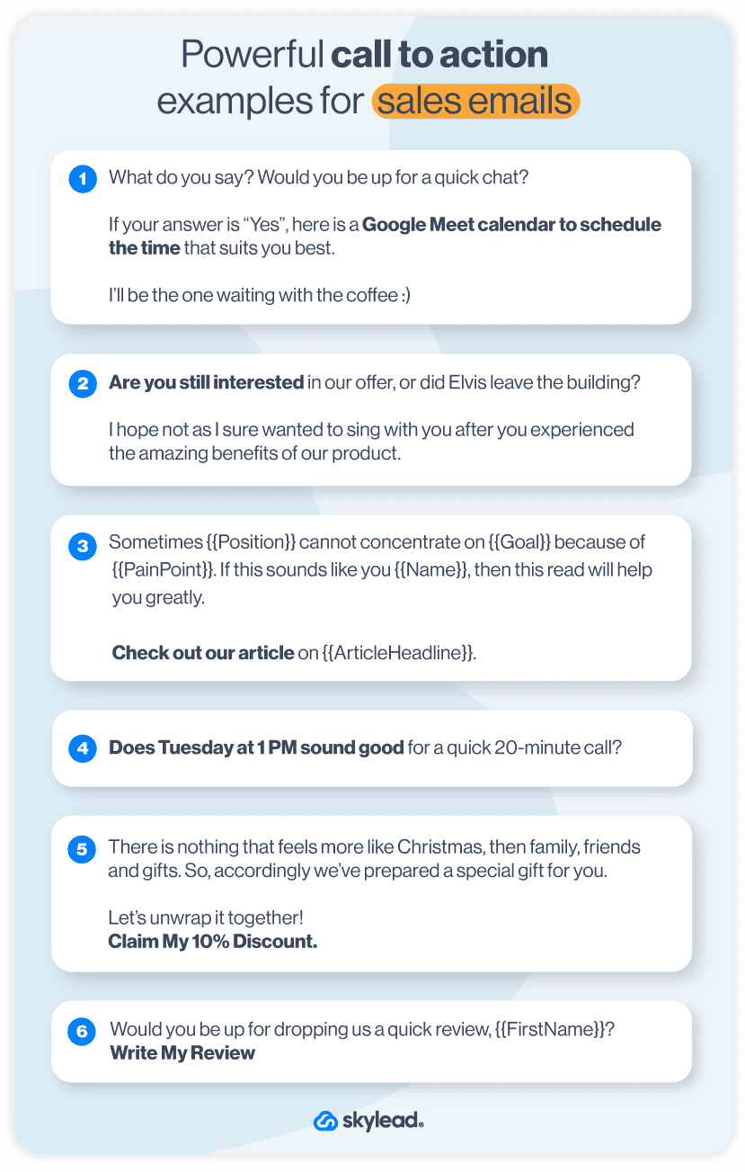
Source: Skylead
This guide delves into the intricacies of creating persuasive CTAs that are pivotal in increasing conversion rates. We’ve examined what elements constitute a compelling call to action and how incorporating sophisticated methods such as urgency tactics and A/B testing can significantly improve your digital marketing campaigns.
By implementing these strategies, you’ll be able to transform your CTAs from mere prompts into potent instruments that guide users on their path, culminating in enhanced engagement and elevated conversion rates. Acknowledging that a masterfully devised CTA goes beyond merely spurring an action is essential. It is about crafting a compelling proposition that genuinely connects with your target audience.
Frequently Asked Questions
Why is it important to use action verbs in CTAs?
Using action verbs in Calls to Action (CTAs) is crucial because they convey a clear and immediate directive to users, prompting them to take specific action. Phrases like “Buy Now,” “Sign Up,” or “Download” help guide users on what to do next. These verbs create a sense of urgency and drive users toward taking the next step, which can ultimately boost conversion rates.
How can I create urgency in my CTAs?
To create urgency in your CTAs, you can use phrases such as “Limited Time Offer,” “Act Now,” or “Hurry, Offer Ends Soon.” Emphasising limited availability, whether it’s stock or time, appeals to the fear of missing out (FOMO) and encourages users to take immediate action. Incorporating countdown timers or showing real-time data (e.g., “Only 3 spots left!”) can also visually reinforce the urgency and motivate users to act quickly.
What are secondary CTAs, and why should I use them?
Secondary CTAs are alternative options designed to engage users who may not be ready to take the primary action. For example, if the primary CTA is “Buy Now,” a secondary CTA could be “Learn More” or “Join Our Newsletter.” These options provide users with a way to engage without feeling pressured, improving overall user experience and capturing leads from visitors who aren’t yet ready to commit to the main offer.
Using secondary CTAs can help maintain engagement, increase retention, and guide users down the sales funnel.
How do I know which CTA is most effective?
To determine which CTA is the most effective, you can conduct A/B testing. By testing different versions of a CTA—whether it’s the wording, design, placement, or urgency—you can track key metrics such as conversion rates and click-through rates. This data-driven approach helps you understand what resonates best with your audience and ensures that you choose the CTA that drives the most action.
Regular testing and optimization can lead to higher engagement and improved conversion outcomes.

