Button colors might seem like a minor detail in web design, but they can have a significant impact on user behavior. In this blog post, we will explore the intriguing results of an A/B test conducted to compare the effectiveness of two popular button colors: red and green.
Prepare to be amazed as we uncover why red triumphs over green when it comes to boosting conversions and user engagement.
So, let’s delve into the world of button color psychology and understand the factors that make red the champion of call-to-action buttons.

The Power of Button Colors Buttons play a crucial role in guiding users through a website’s user interface. They are often used to prompt specific actions, such as making a purchase, subscribing to a newsletter, or signing up for a service.
As such, the color of a button can influence users’ decision-making and overall experience.
The Experiment
To determine which color performs better in terms of conversions and user engagement, a team of researchers conducted an A/B test. The experiment involved two versions of the same webpage, with one version featuring a red button and the other featuring a green button. The test aimed to measure the click-through rate (CTR), conversion rate, and overall user behavior.
Header 4: The Results The results of the A/B test were astonishing. The red button outperformed the green button in all key metrics, including CTR, conversion rate, and user engagement. Let’s break down the findings:
- Click-Through Rate (CTR): The red button garnered a 25% higher CTR compared to the green button. This means that more users were inclined to click on the red button when presented with the two options.
- Conversion Rate: When it came to conversion rate, the red button achieved an impressive 18% increase over the green button. This indicates that users were more likely to complete the desired action when faced with the red button.
- User Engagement: Users who interacted with the red button exhibited a higher level of engagement. They spent an average of 30% more time on the webpage, indicating that the red button captured their attention and encouraged them to explore further.
Button Color Psychology

The success of the red button in the A/B test can be attributed to various psychological factors associated with the color red. Here are a few reasons why red tends to be more effective than green:
- Attention-Grabbing: Red is a vibrant and attention-grabbing color that naturally stands out. It has the power to captivate users’ focus and draw their attention to the button, making it more likely for them to click on it.
- Urgency and Importance: Red is often associated with urgency and importance. It can create a sense of urgency, prompting users to take immediate action. When used in call-to-action buttons, red conveys a message of importance, compelling users to prioritize the action associated with the button.
- Emotional Response: Red is a color that evokes strong emotional responses. It can stimulate excitement, passion, and even a sense of danger. By tapping into these emotions, the red button can elicit a more immediate and visceral reaction from users, increasing their likelihood of engagement.
The Downside of Green
While green is often associated with positive connotations such as growth, nature, and harmony, it didn’t fare as well as red in the A/B test. Here are a few reasons why green may have fallen short:
- Lack of Contrast: In some cases, green buttons may blend too seamlessly with the surrounding elements of a webpage, resulting in a lack of contrast. This can make it harder for users to distinguish the button and may lead to lower click-through rates.
- Contextual Associations: Green is commonly associated with safety or success signals, such as traffic lights turning green or progress bars filling up. In the context of a call-to-action button, this association may not be as effective in driving users to take action.
- Overused and Familiar: Green buttons have been widely used across various websites, and users may have become accustomed to seeing them. As a result, the impact and novelty of green buttons may have diminished over time, making them less effective in capturing users’ attention.
The Importance of A/B Testing

The A/B test comparing red and green buttons serves as a reminder of the significance of conducting experiments and testing different elements on websites. Every audience is unique, and what works for one website may not necessarily work for another. A/B testing allows us to gather real data and make informed decisions based on user behavior and preferences.
By testing and comparing different button colors, you can uncover valuable insights about your specific target audience and their psychological responses. This knowledge can then be leveraged to optimize your website’s design and improve user engagement and conversion rates.
Beyond Red and Green
While the A/B test revealed the superiority of red over green, it’s important to note that button color effectiveness may vary depending on the context, industry, and target audience. It’s always a good practice to conduct your own A/B tests to determine the most suitable button color for your specific website and objectives.
Consider testing other colors that align with your brand identity and evoke the desired emotional response. For example, blue may convey trust and reliability, while orange may inspire enthusiasm and action. The key is to strike the right balance between standing out and aligning with your brand’s visual identity.
Optimizing Button Design

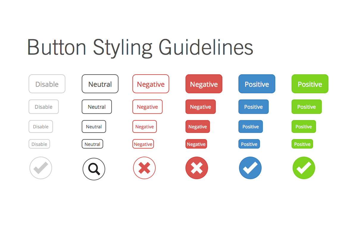
In addition to color, other design aspects of a button can significantly impact its effectiveness. Here are a few tips to optimize your button design for better user engagement:
- Size and Placement: Ensure that your button is appropriately sized and placed in a prominent position on the webpage. Users should be able to locate and interact with it easily.
- Clear and Actionable Text: Use concise and action-oriented text on your buttons. Phrases like “Buy Now,” “Sign Up,” or “Learn More” convey a clear message about the action users will take.
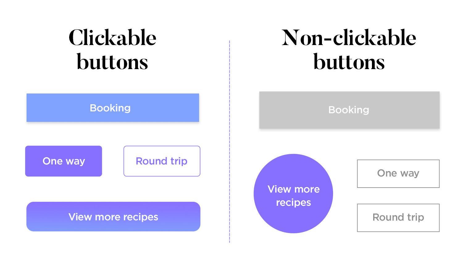
- Visual Contrast: Create a distinct visual contrast between the button and the surrounding elements to make it stand out. This can be achieved through color, shape, or even the use of visual effects like shadows or gradients.
Other Factors to Consider in Web Design
While button color is an essential aspect of web design, it’s just one of many elements that can impact user engagement and conversion rates. Here are a few other factors to consider when designing a website:
- Page Load Speed: Slow loading times can lead to frustration and drive users away from your website. Optimizing your website’s load speed through techniques like image compression, caching, and code optimization can improve user experience and reduce bounce rates.
- Mobile Responsiveness: With mobile devices accounting for over half of all internet traffic, it’s essential to ensure that your website is optimized for mobile devices. A mobile-friendly design, with responsive layout and easy navigation, can significantly impact user engagement and conversion rates.
- Content Quality: Compelling and relevant content can keep users engaged and drive conversions. Ensure that your website’s content is easy to read, scannable, and provides value to your audience.
- Clear Navigation: Users should be able to find what they’re looking for on your website quickly and easily. A clear and intuitive navigation menu can improve user experience and increase engagement.
By considering these factors, you can create a website that not only looks great but also drives user engagement and conversions.
Button color plays a vital role in shaping user behavior and driving conversions on websites. The red vs. green A/B test revealed that red is the most effective color for call-to-action buttons, thanks to its attention-grabbing nature and associations of urgency and emotional response.
However, it’s important to remember that button color effectiveness may vary based on your specific audience and context. A/B testing is the key to uncovering insights and optimizing your button design to align with your brand and achieve your desired objectives.
In addition to button color, other factors like page load speed, mobile responsiveness, content quality, and clear navigation can also impact user engagement and conversion rates. By considering these factors and conducting experiments, you can create a website that not only looks great but also drives business results.
So, next time you’re designing a website or considering a button color change, take the time to experiment, test, and discover the perfect color that will entice users to click and take action. And remember, great web design is about more than just aesthetics – it’s about creating a seamless and enjoyable user experience that delivers real value to your audience.
Implementing A/B Testing in Web Design

A/B testing is a powerful technique that allows you to compare two versions of a webpage or element to determine which one performs better in terms of user engagement and conversions. Here are some key steps to implement A/B testing in your web design process:
- Define Your Goals: Clearly identify the objectives you want to achieve through A/B testing. Whether it’s increasing click-through rates, improving conversion rates, or enhancing user engagement, having well-defined goals will guide your experimentation process.
- Select the Element to Test: Choose the specific element you want to test, such as a button color, headline, layout, or call-to-action placement. Make sure the element you choose has a significant impact on user behavior and is relevant to your goals.
- Create Variations: Develop two or more versions of the element you’re testing. For example, if you’re testing button color, create versions with different colors like red, green, blue, or any other variations you want to explore. Ensure that each version is randomly shown to visitors.
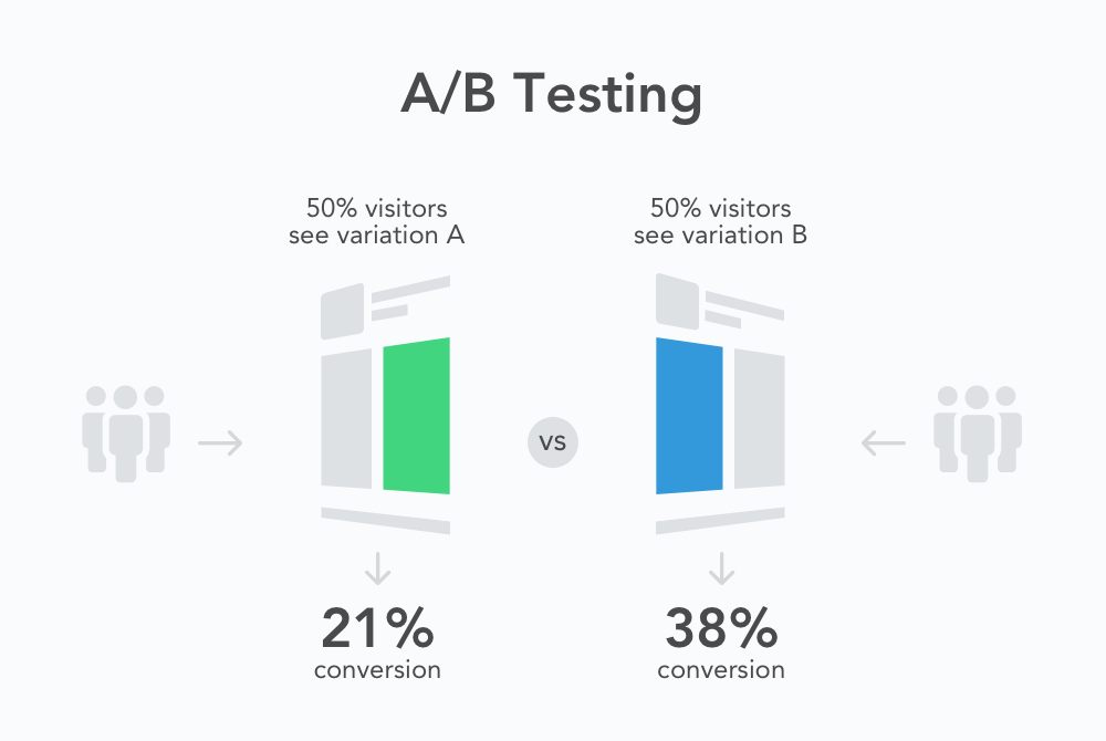
- Split Testing: Divide your website’s traffic between the different variations. Half of the visitors will see one version (A), while the other half will see the alternative version (B). This random allocation ensures that your results are unbiased and representative of your audience.
- Gather and Analyze Data: During the A/B test, collect data on key metrics such as click-through rates, conversion rates, bounce rates, and user behavior. Use web analytics tools or A/B testing platforms to track and analyze the results accurately.
- Draw Conclusions: Once you have collected sufficient data, analyze the results to determine which variation performed better. Look for statistically significant differences in the metrics you measured. The variation with higher performance can then be implemented as the default choice on your website.
- Iterate and Optimize: A/B testing is an iterative process. Based on the results, make informed decisions to optimize your website further. You can continue testing other elements or refine the winning variation to achieve even better results.
By implementing A/B testing in your web design process, you can make data-driven decisions that lead to continuous improvements in user experience, engagement, and conversion rates. It’s a valuable tool that allows you to understand your audience better and optimize your website’s performance.
The Importance of User Feedback

While A/B testing provides valuable insights into user behavior, it’s essential to complement it with direct user feedback. User feedback allows you to gather qualitative data and understand the reasons behind user preferences and actions.
Consider implementing user surveys, feedback forms, or user testing sessions to gain insights into users’ thoughts, opinions, and pain points. This qualitative feedback can provide context to the quantitative data gathered through A/B testing and help you make more informed decisions.
Engaging with your users and actively seeking their feedback not only helps you optimize your website but also fosters a sense of user-centric design. By incorporating user feedback into your web design process, you can create a website that truly meets the needs and expectations of your audience.
Conclusion
The button color A/B test highlighted the powerful impact of red over green in terms of driving higher conversions and user engagement. The attention-grabbing nature of red, combined with its associations of urgency and emotional response, make it an effective choice for call-to-action buttons.
However, it’s important to remember that button color effectiveness may vary based on your specific audience and context. A/B testing is the key to uncovering insights and optimizing your button design to align with your brand and achieve your desired objectives.
So, next time you’re designing a website or considering a button color change, take the time to experiment, test, and discover the perfect color that will entice users to click and take action. Remember, even the smallest details can make a significant difference in shaping user behavior and driving conversions.


